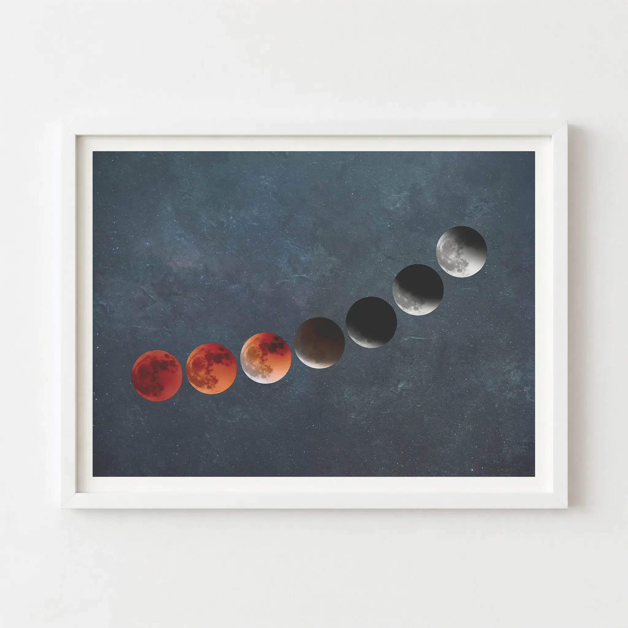
 Image 1 of 6
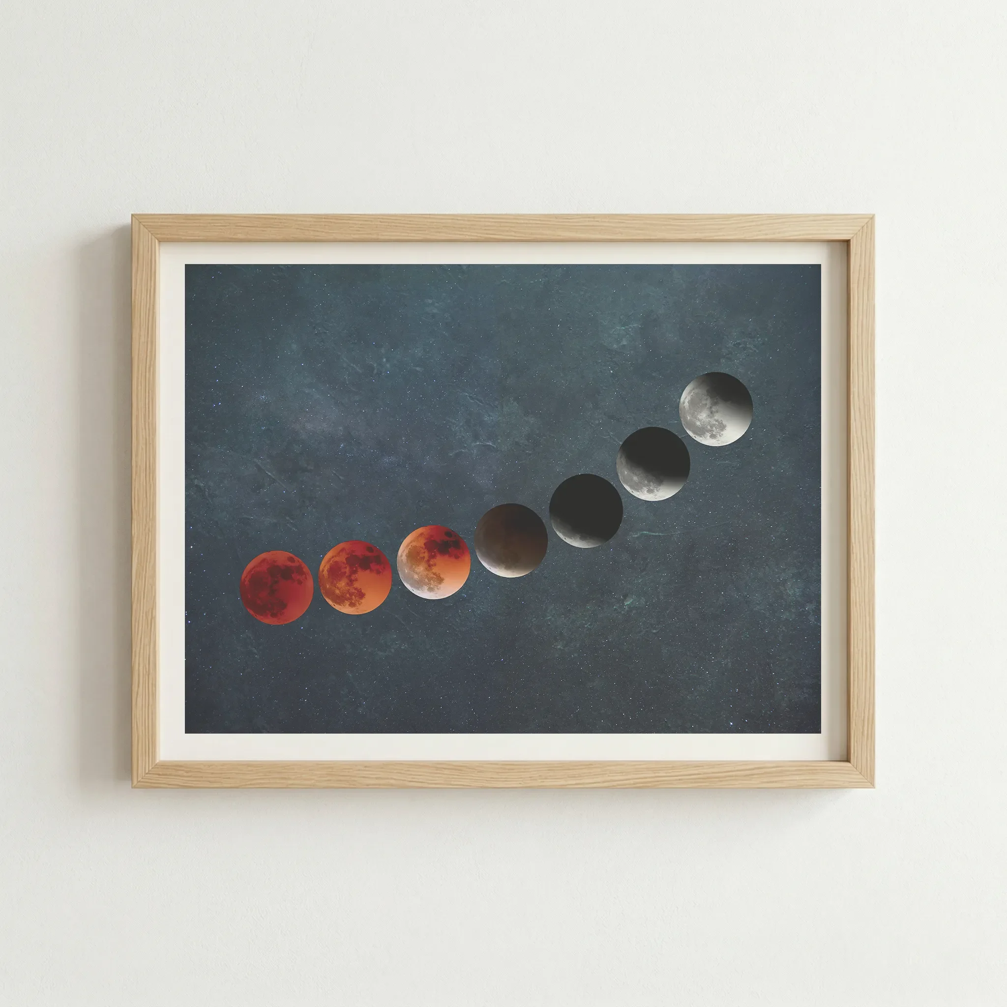
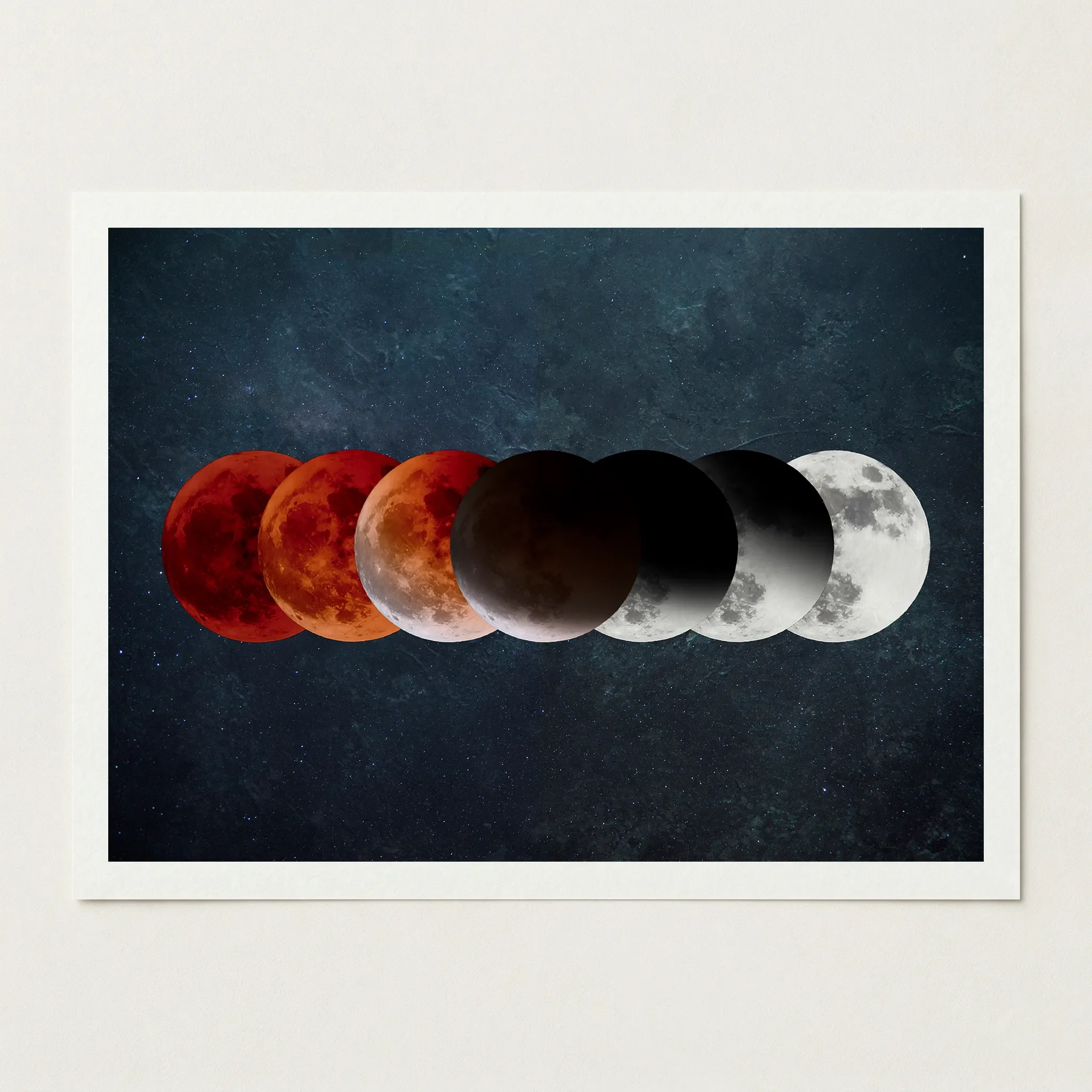 Image 2 of 6
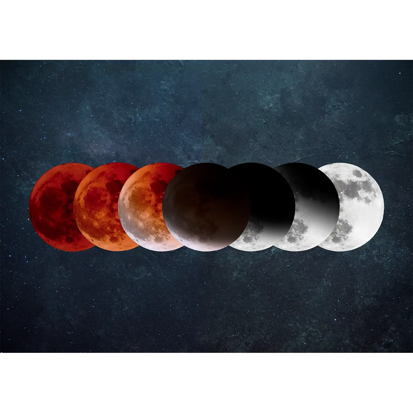
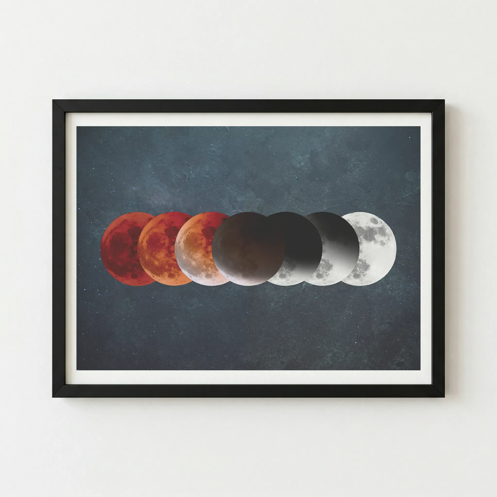 Image 3 of 6
 Image 4 of 6
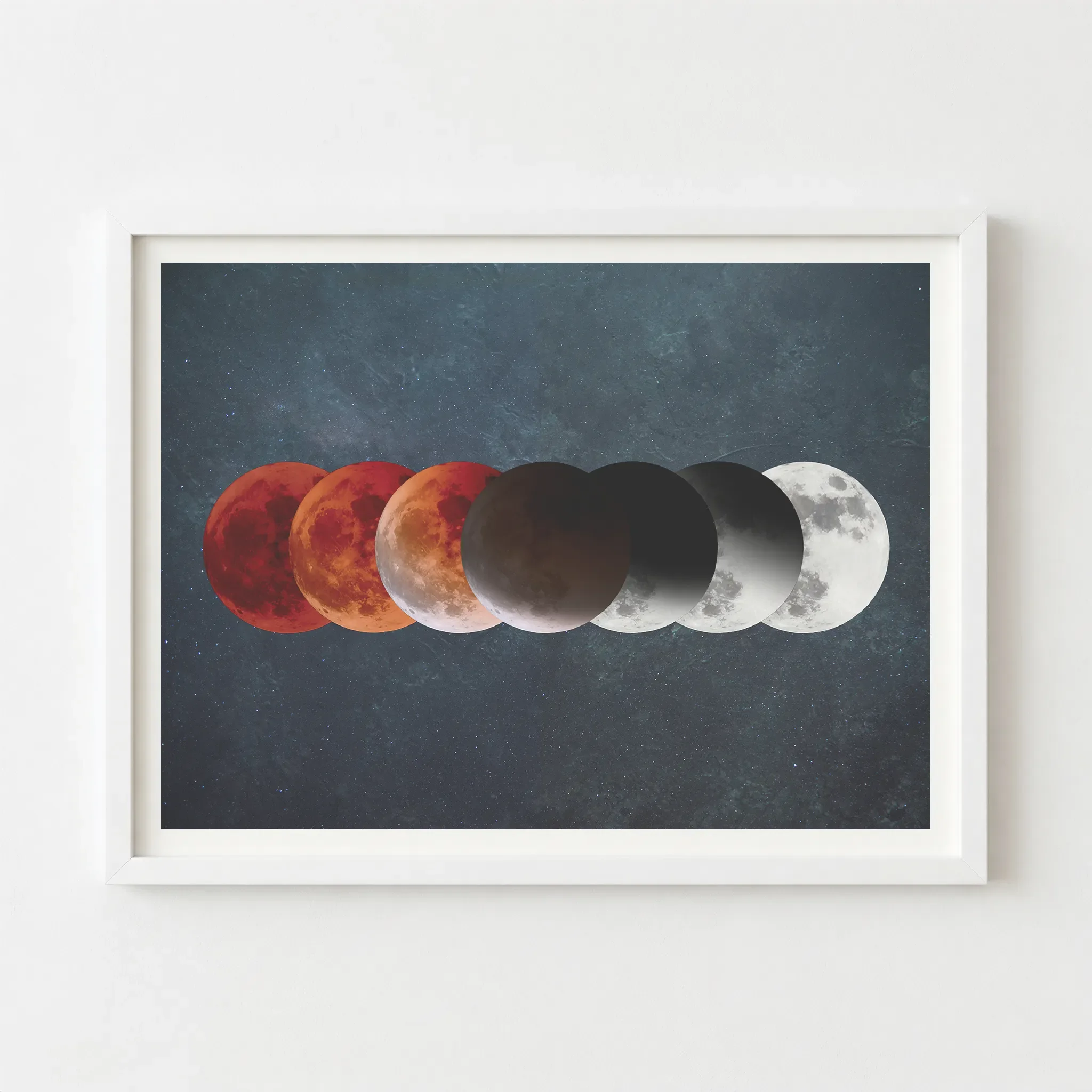 Image 5 of 6
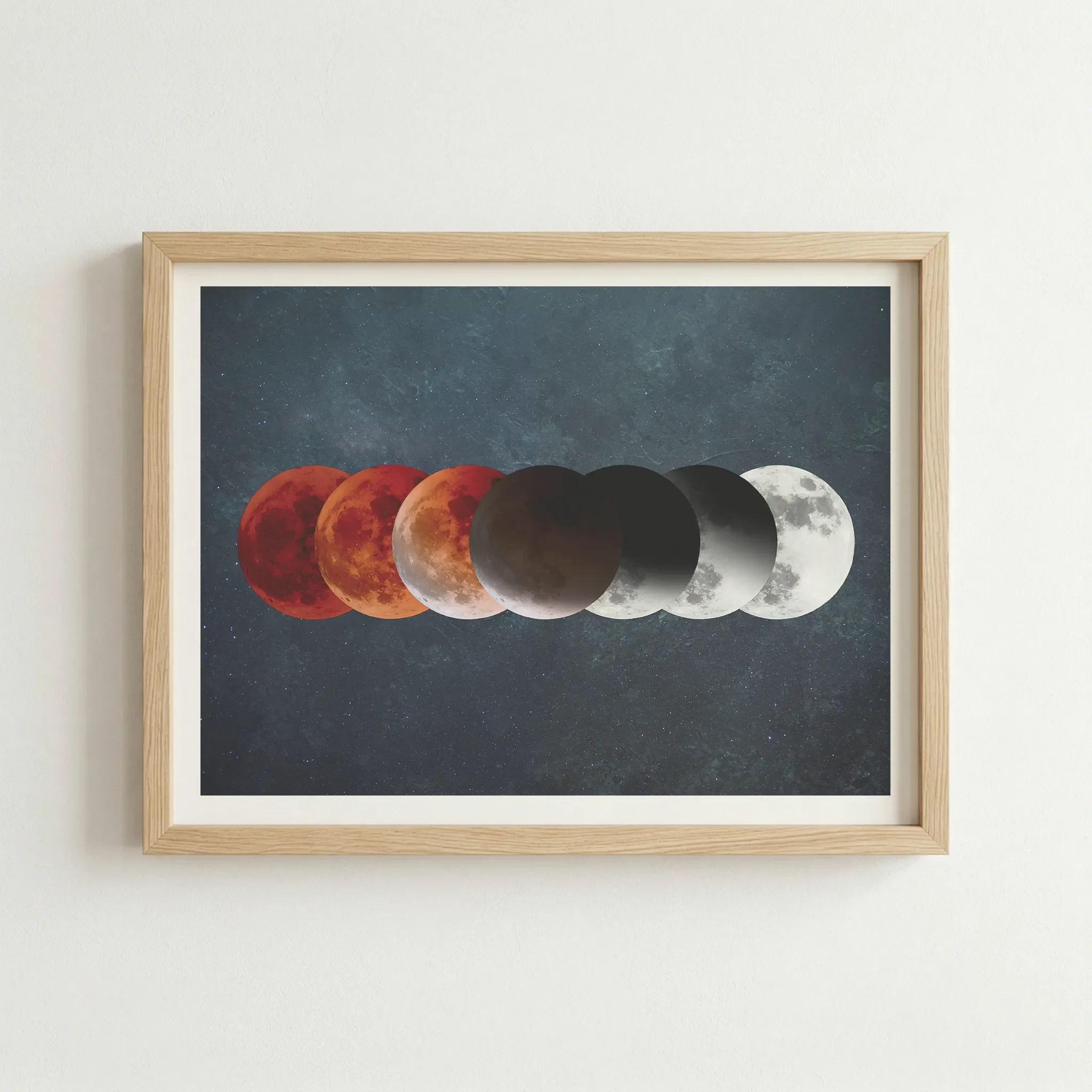 Image 6 of 6
Technical Specifications
| Feature | Unframed | Framed |
|---|---|---|
| Print Quality | 12-colour Giclée (Archival) | 12-colour Giclée (Archival) |
| Paper Stock | 200gsm Museum-Grade Matte | 200gsm Museum-Grade Matte |
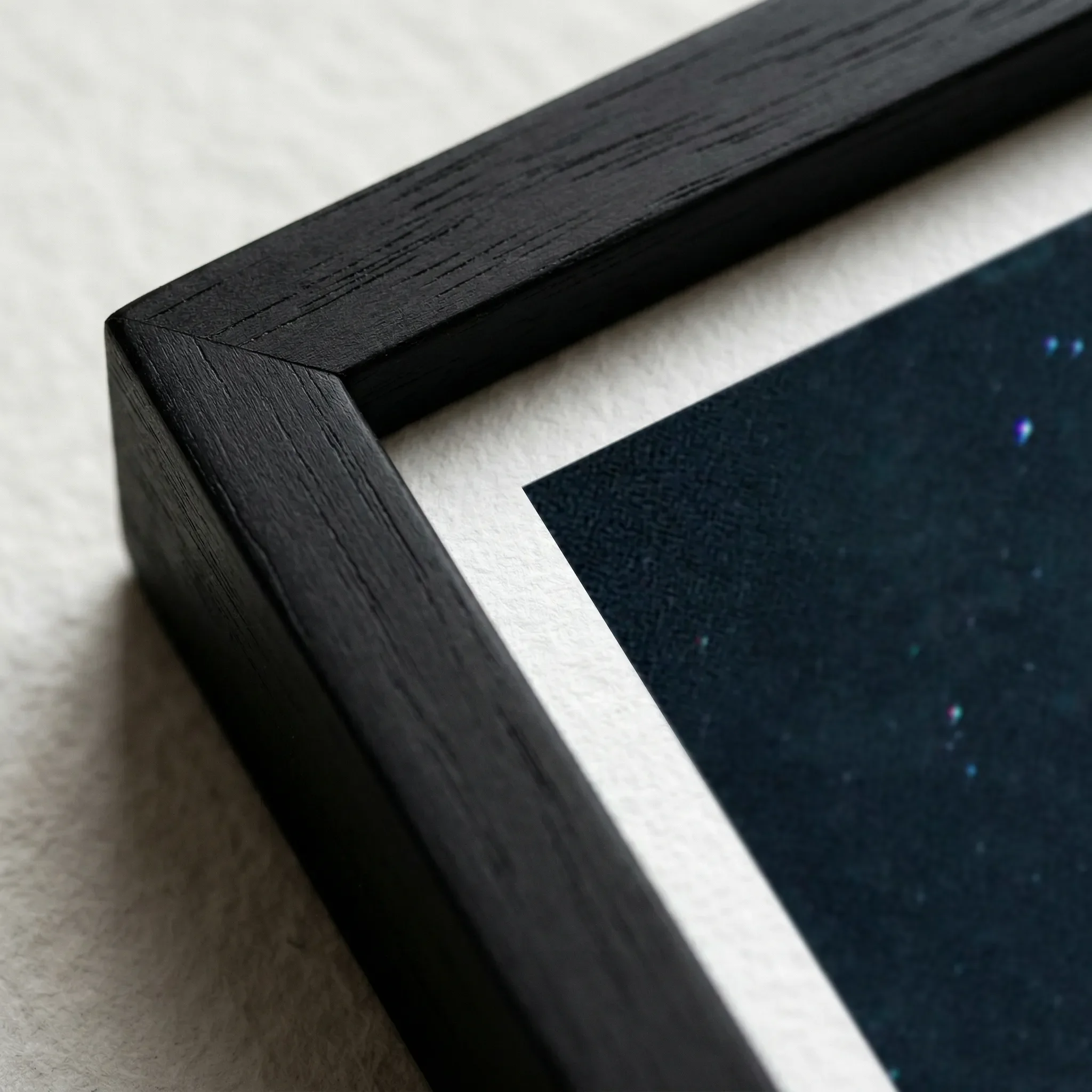
| Frame Material | — | FSC-certified sustainable wood |
| Sustainability | 2 Trees Planted Per Order | 2 Trees Planted Per Order |
Size Guide
| Size | Metric (cm) | Imperial (in) |
|---|---|---|
| A4 | 29.7 × 21.0 | 11.7 × 8.3 |
| A3 | 42.0 × 29.7 | 16.5 × 11.7 |
| A2 | 59.4 × 42.0 | 23.4 × 16.5 |
| A1 | 84.1 × 59.4 | 33.1 × 23.4 |
Frame Colour
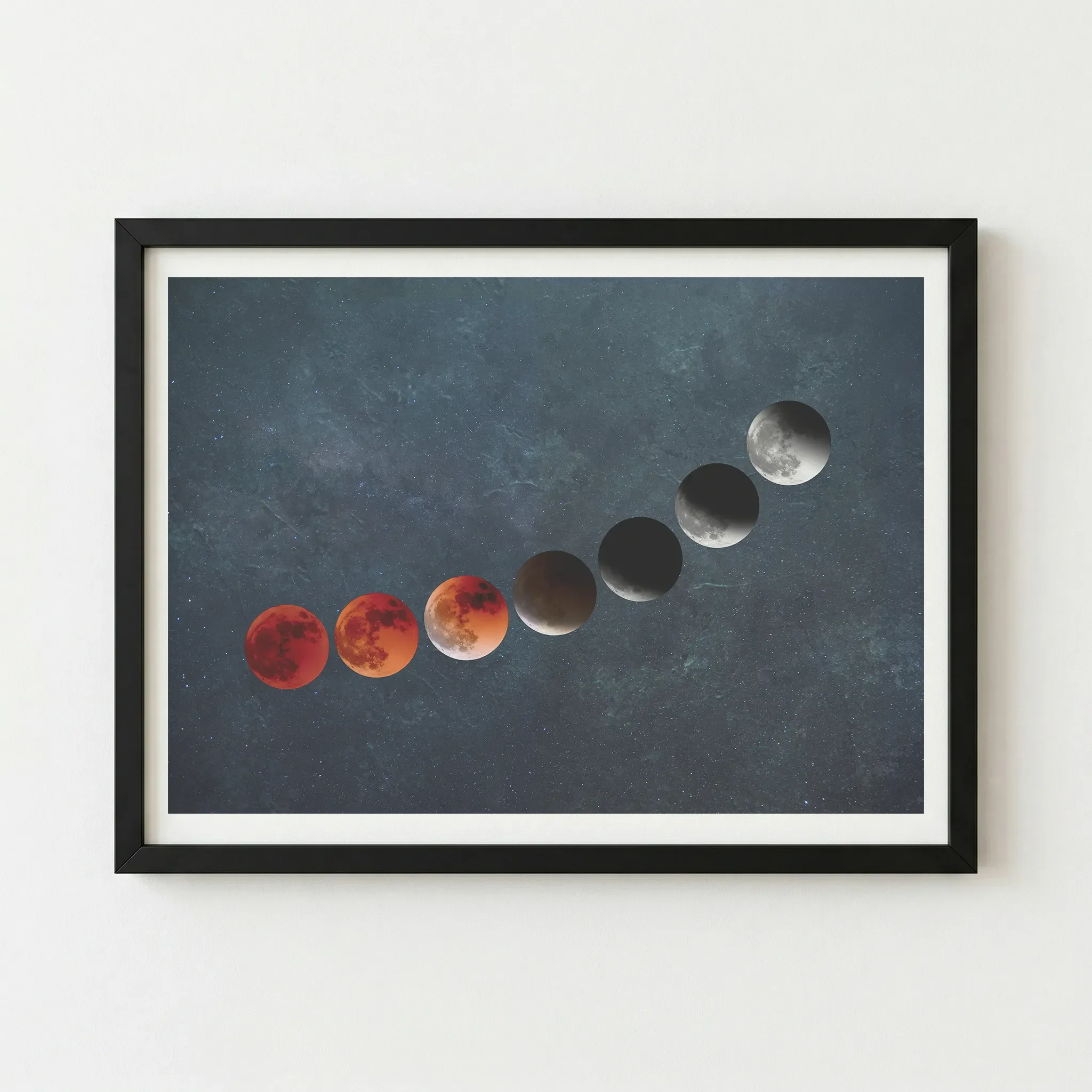
Black (Artist’s Choice)
Why This Works
The artwork features a dark, starry sky. A Black frame blends seamlessly into the edges of the print, making the frame "disappear" and allowing the moon phases to float dramatically on your wall.
The Vibe (Immersive & Infinite)
This is the "Stargazer’s" look. It provides a sophisticated, professional finish that feels like a window into deep space.
Wood
Why This Works
The moon is a natural body that governs the tides and rhythms of Earth. A Natural Wood frame grounds the celestial imagery, making the cosmic art feel warm and connected to the home.
The Vibe (Grounded & Ethereal)
This creates a "Natural Balance" feel, ideal for spaces that incorporate plants and organic materials.
White
Why This Works
A White frame provides a sharp, graphic contrast to the dark teal background. it makes the bright "full moon" at the end of the sequence pop, emphasising the theme of emerging into the light.
The Vibe (Modern & Graphic)
This creates a Clean & Contemporary look, perfect for modern apartments and minimalist décor.
Artist's Nudge
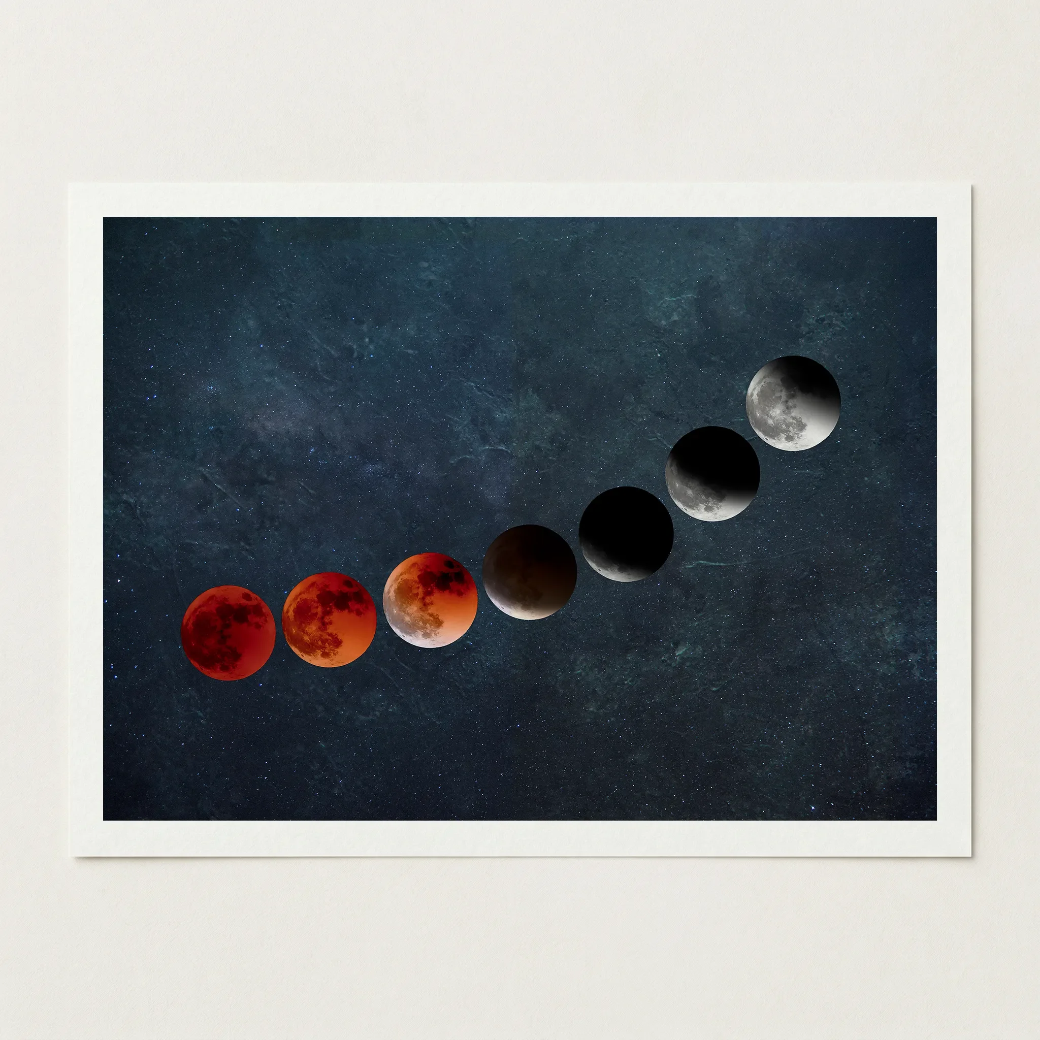
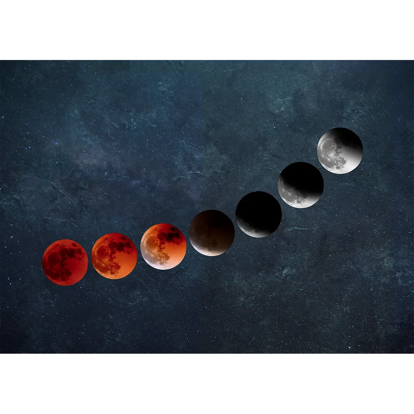
To truly capture the "Emerging Into Light" narrative and the depth of the July 2018 eclipse, I highly recommend the Black frame. It anchors the cosmic background, allowing the transition from blood-red to brilliant white to be the undisputed star of the room.
Frequently Asked Questions
Is this based on a real event?
Yes, it was inspired by the total lunar eclipse on 27th July 2018. It was a particularly special event because the moon was at its furthest point from Earth, making the eclipse last much longer than usual.
How is the "glow" of the moon achieved on paper?
We use a 12-colour Giclée process with archival pigment inks. This allows for incredibly smooth colour gradients, ensuring the transition from the deep red umbra to the bright lunar surface feels luminous and realistic.
What are the white spots in the background?
These represent distant stars and nebulae within the cosmic void. Our high-definition printing ensures these fine details remain crisp and clear, rather than looking like dust or noise.
Does the matte paper make the dark colours look flat?
Quite the opposite. Our 200gsm museum-grade matte paper is designed to provide deep, velvety blacks and rich teals without the distracting glare of glossy paper, allowing the lunar details to truly stand out.
Is this a photograph or a digital illustration?
It is a composite piece of digital fine art, combining realistic lunar textures with an artistic interpretation of the eclipse progression to highlight the symbolic "emergence" into light.