 Image 1 of 6
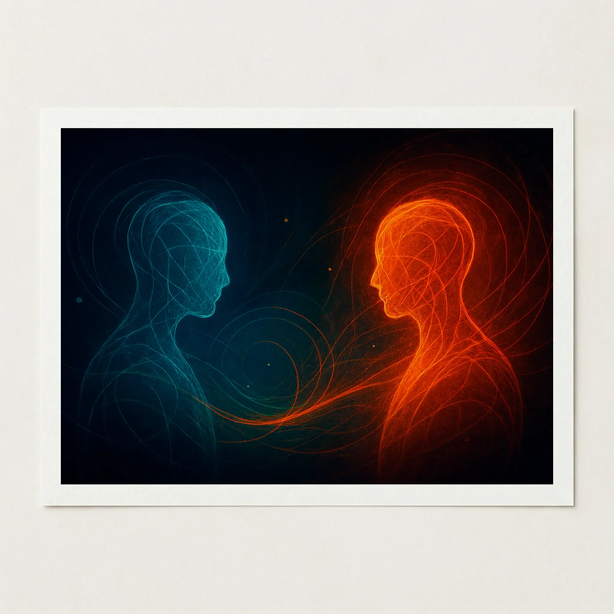 Image 2 of 6
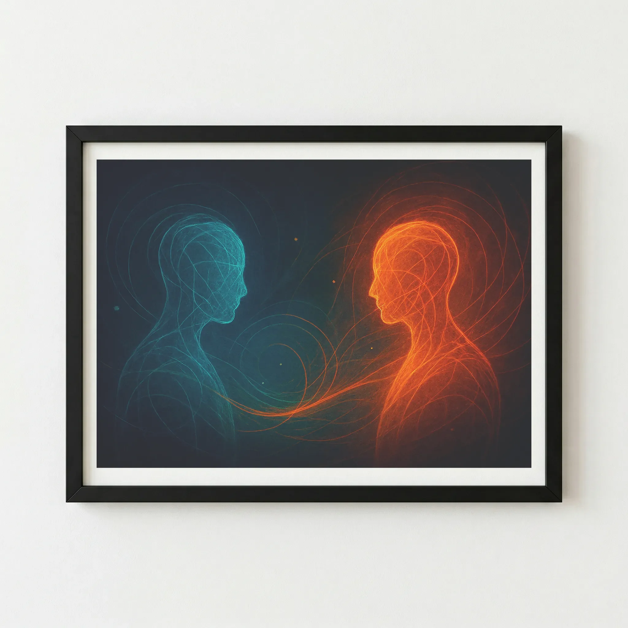 Image 3 of 6
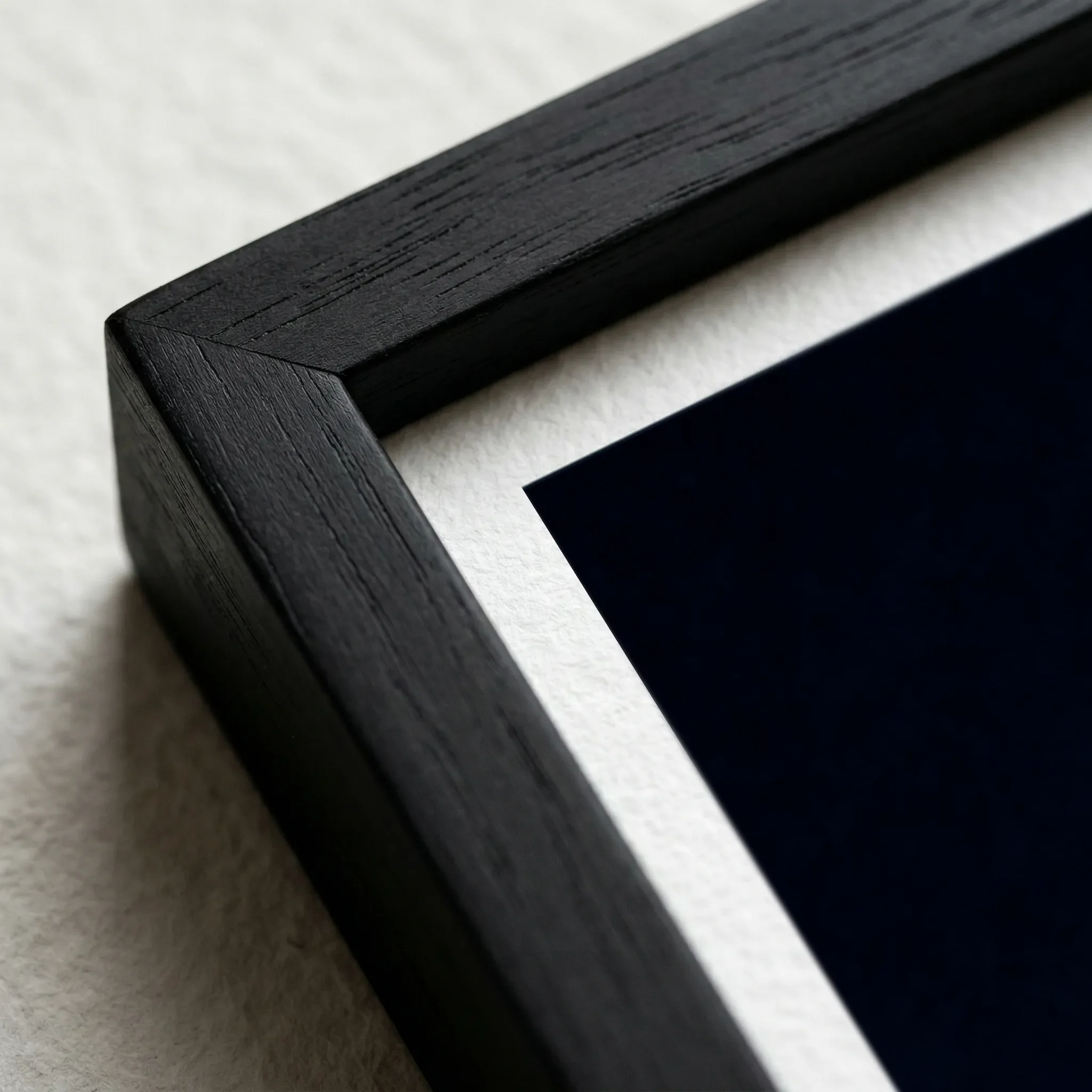 Image 4 of 6
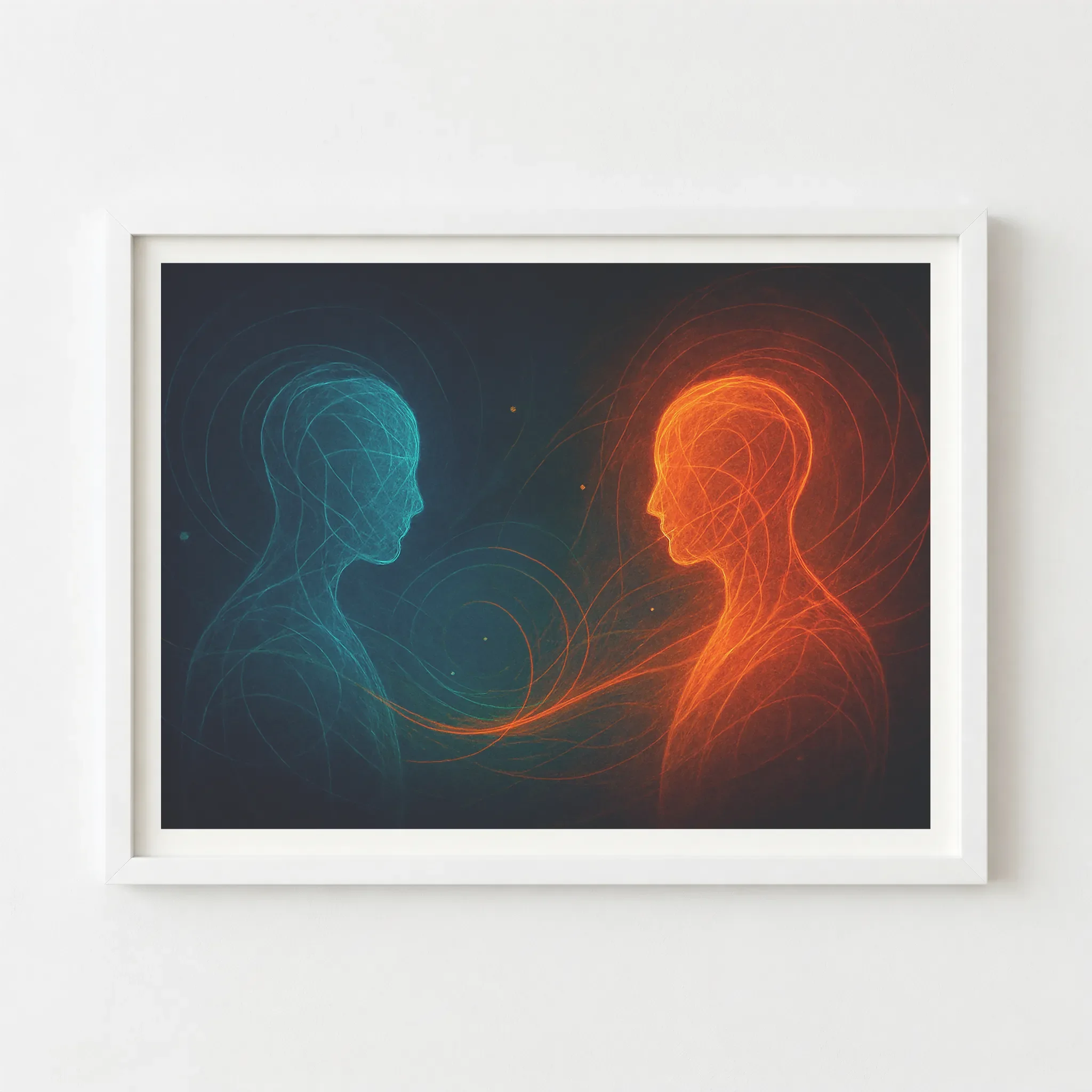 Image 5 of 6
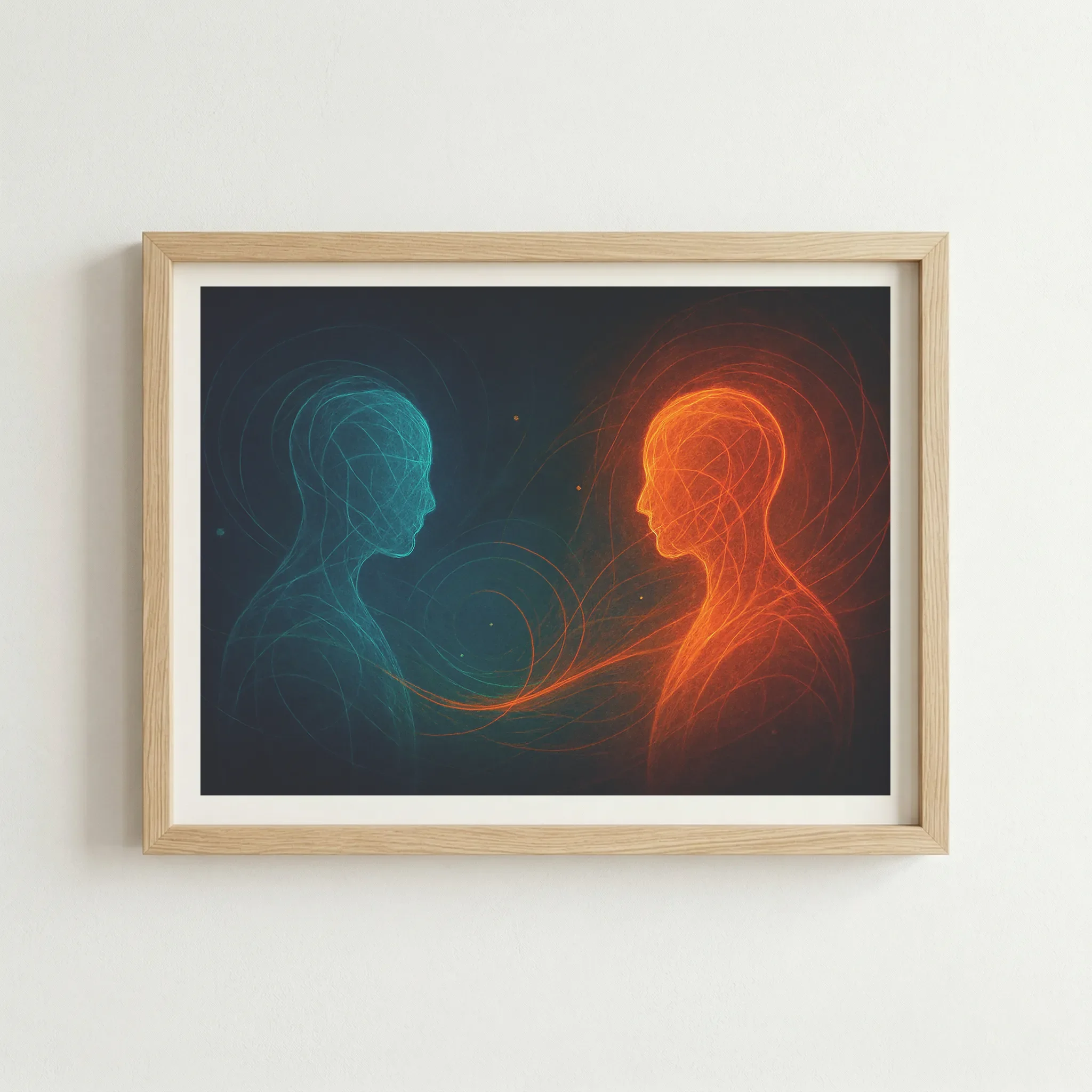 Image 6 of 6
Technical Specifications
| Feature | Unframed | Framed |
|---|---|---|
| Print Quality | 12-colour Giclée (Archival) | 12-colour Giclée (Archival) |
| Paper Stock | 200gsm Museum-Grade Matte | 200gsm Museum-Grade Matte |
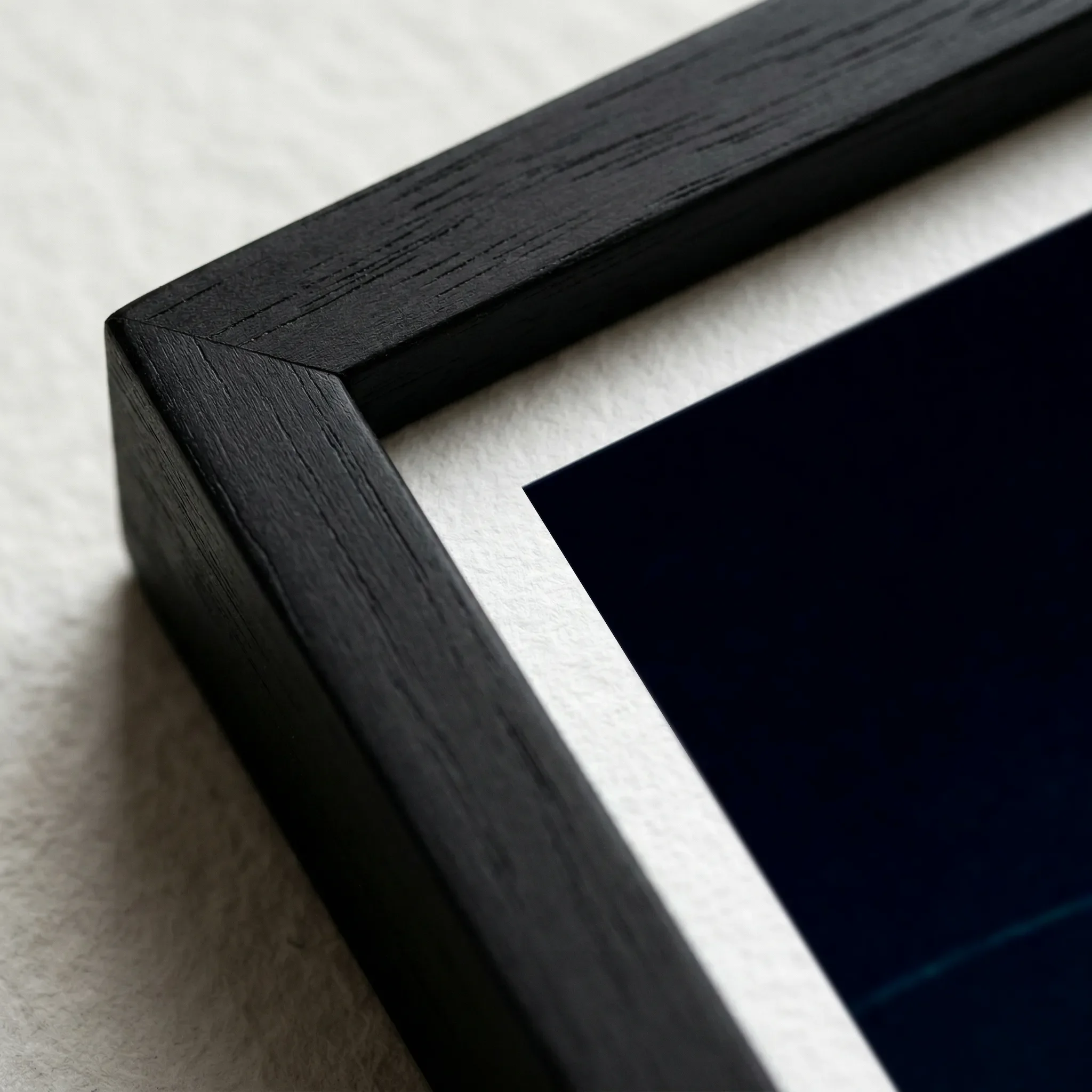
| Frame Material | — | FSC-certified sustainable wood |
| Sustainability | 2 Trees Planted Per Order | 2 Trees Planted Per Order |
Size Guide
| Size | Metric (cm) | Imperial (in) |
|---|---|---|
| A4 | 21.0 × 29.7 | 8.3 × 11.7 |
| A3 | 29.7 × 42.0 | 11.7 × 16.5 |
| A2 | 42.0 × 59.4 | 16.5 × 23.4 |
| A1 | 59.4 × 84.1 | 23.4 × 33.1 |
Frame Colour
Black (Artist’s Choice)
Why This Works
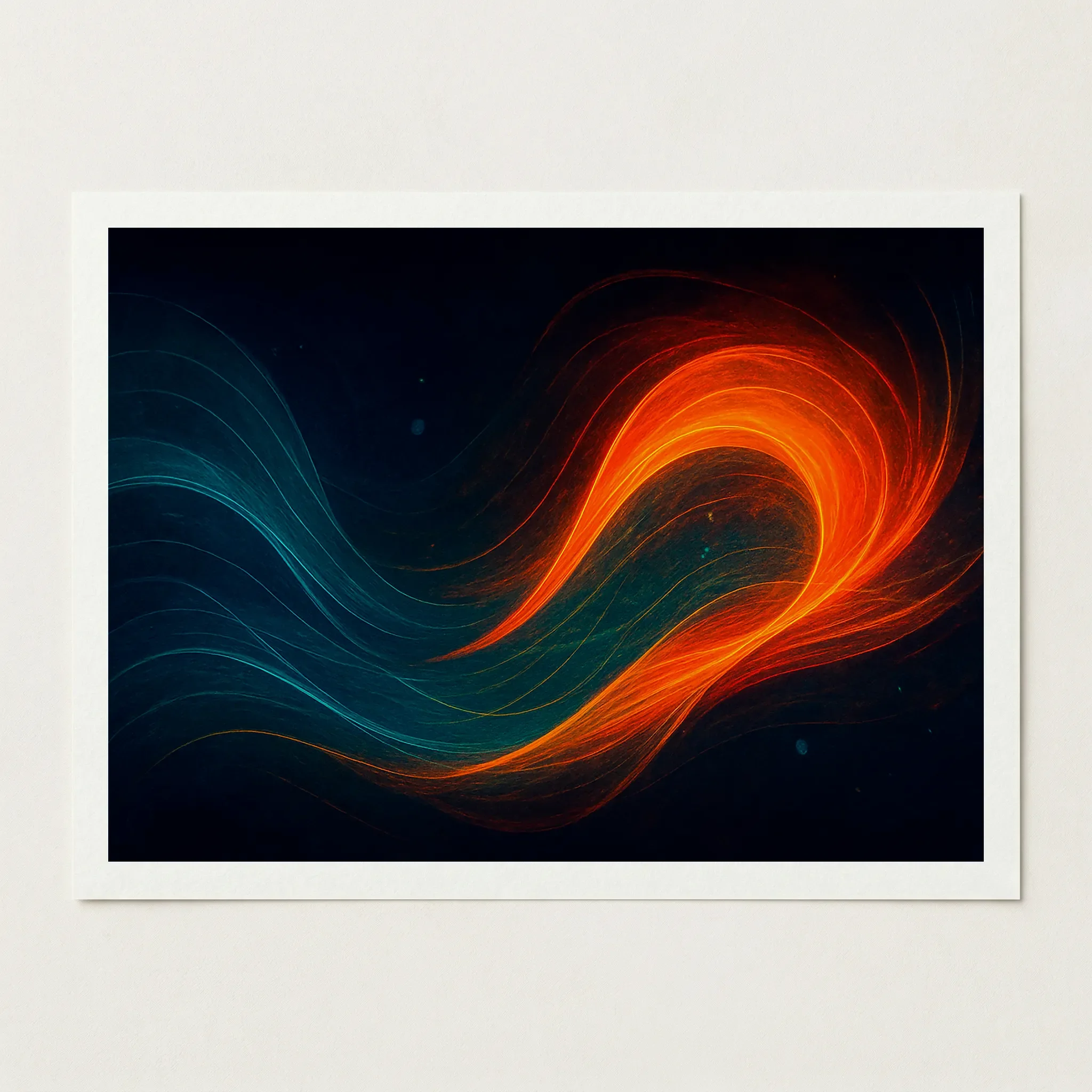
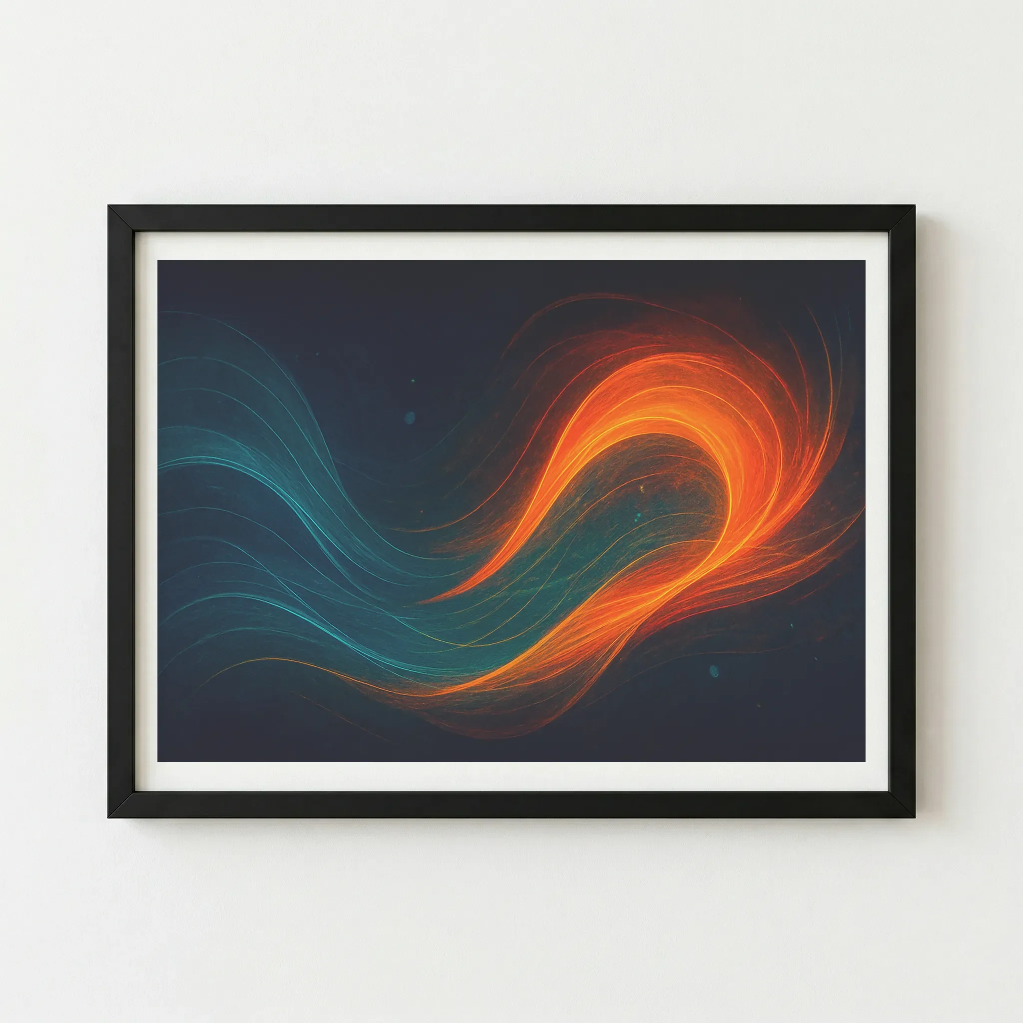
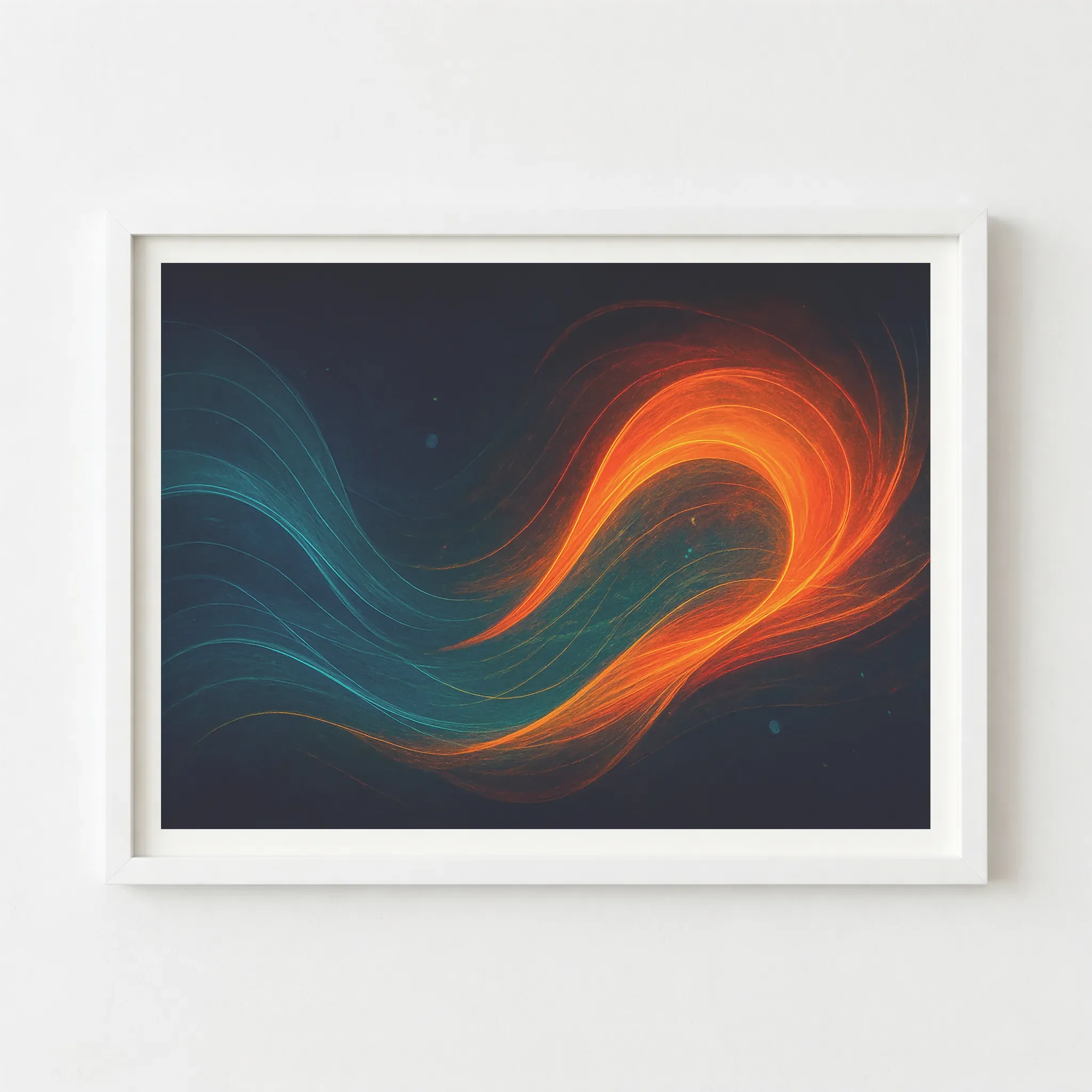
This is the primary recommendation for the Lumen Series. A Black frame provides a bold, modern border that blends seamlessly with the dark, "cosmic void" background of the print. This creates a "black-on-black" tonal depth that makes the glowing teal and orange energy lines appear to vibrate with even more light.
The Vibe
Sophisticated, immersive, and high-energy. It focuses all attention on the internal dialogue of the figures.
Wood
Why This Works
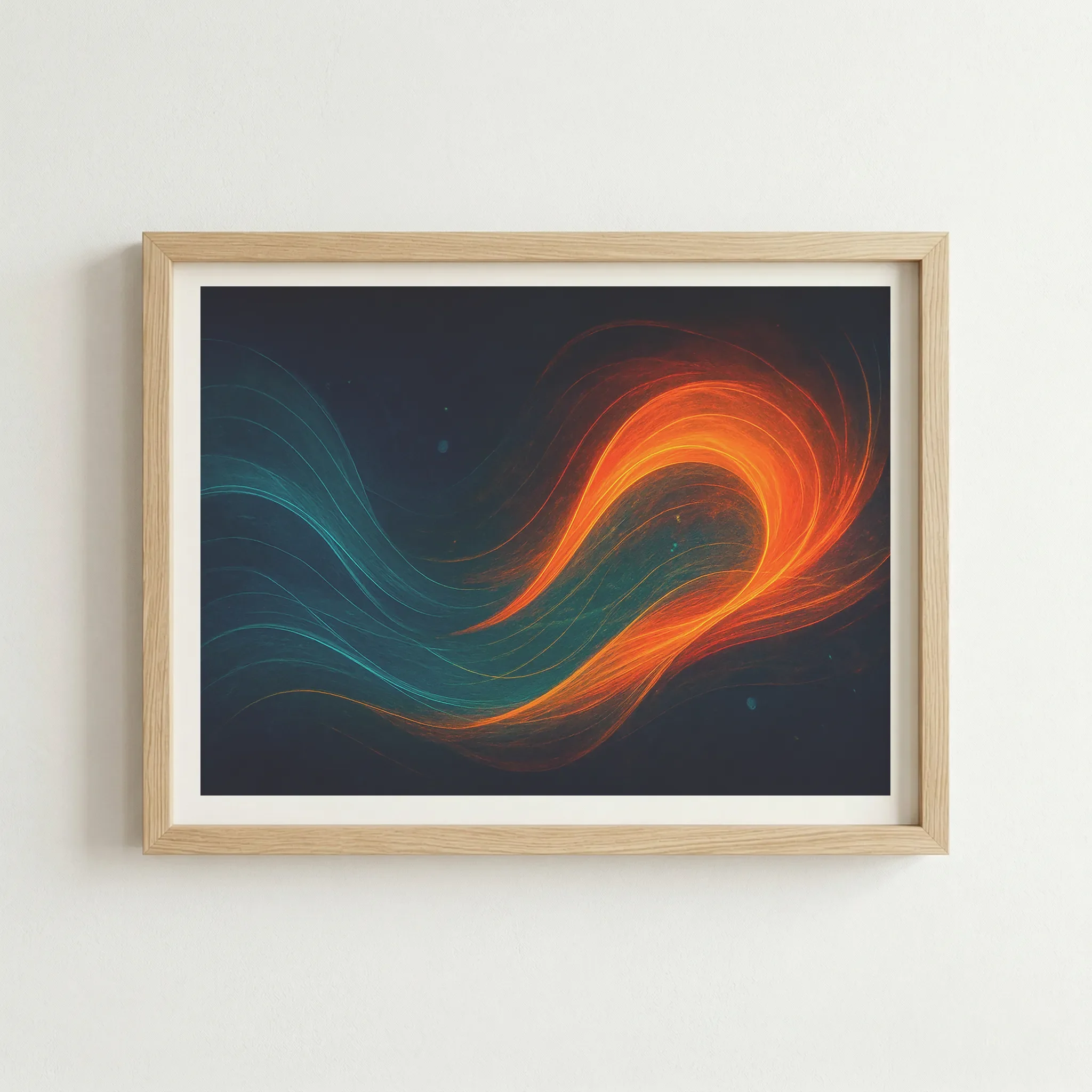
A Natural Wood frame adds an organic, human touch to the digital consciousness theme. It warms up the cool teal tones and grounds the abstract energy, reminding the viewer that this "dialogue" is a natural part of the human condition.
The Vibe
Balanced, warm, and thoughtful. Excellent for personal sanctuaries or therapy spaces.
White
Why This Works
A White frame offers a sharp, contemporary contrast. It acts like a bright window frame looking out into the void, making the entire piece feel lighter and more architectural. It’s a great way to prevent a dark print from feeling too heavy on a light-coloured wall.
The Vibe
Modern, clean, and striking.
Artist's Nudge
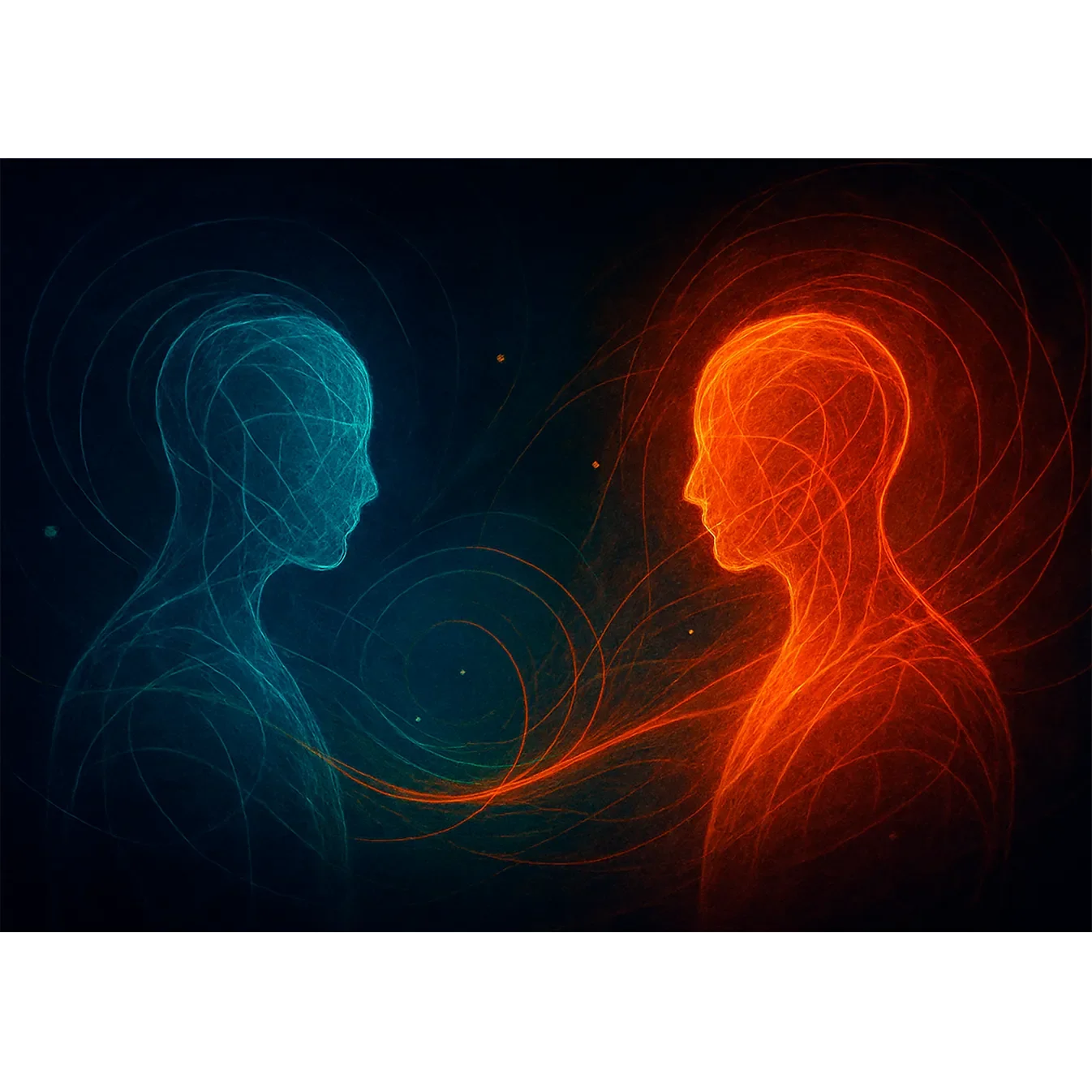
To truly capture the "Harmony of Inner Truths" and make the luminous exchange feel alive on your wall, I highly recommend the Black frame. It provides the depth needed to let the consciousness within the art truly shine.
Frequently Asked Questions
Is 'Dialogue of Selves' part of the Lumen Series?
Yes. It is a key piece in the Lumen Consciousness Series, sharing the same concept of using "luminous lines" to represent internal energy, consciousness, and the flow of thought.
How do the teal and orange colours look in print?
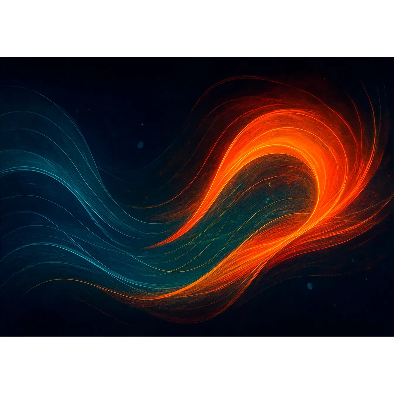
We use a 12-colour archival giclée process that handles vibrant, luminous gradients exceptionally well. The contrast between the cool teal and warm orange remains crisp and radiant against the deep black background.
How is the "glowing" effect achieved on paper?
The "glow" is a result of high-contrast digital artistry combined with museum-grade matte paper. The paper absorbs light rather than reflecting it, allowing the deep blacks to remain velvety and the luminous energy lines to "pop" as if they are backlit.