 Image 1 of 6
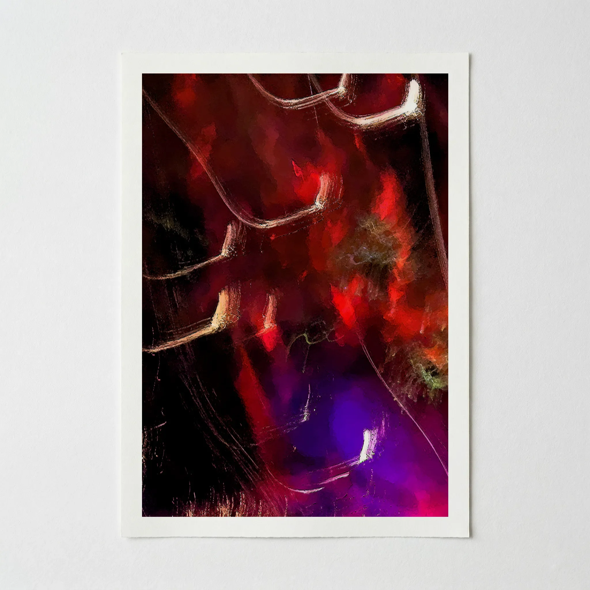 Image 2 of 6
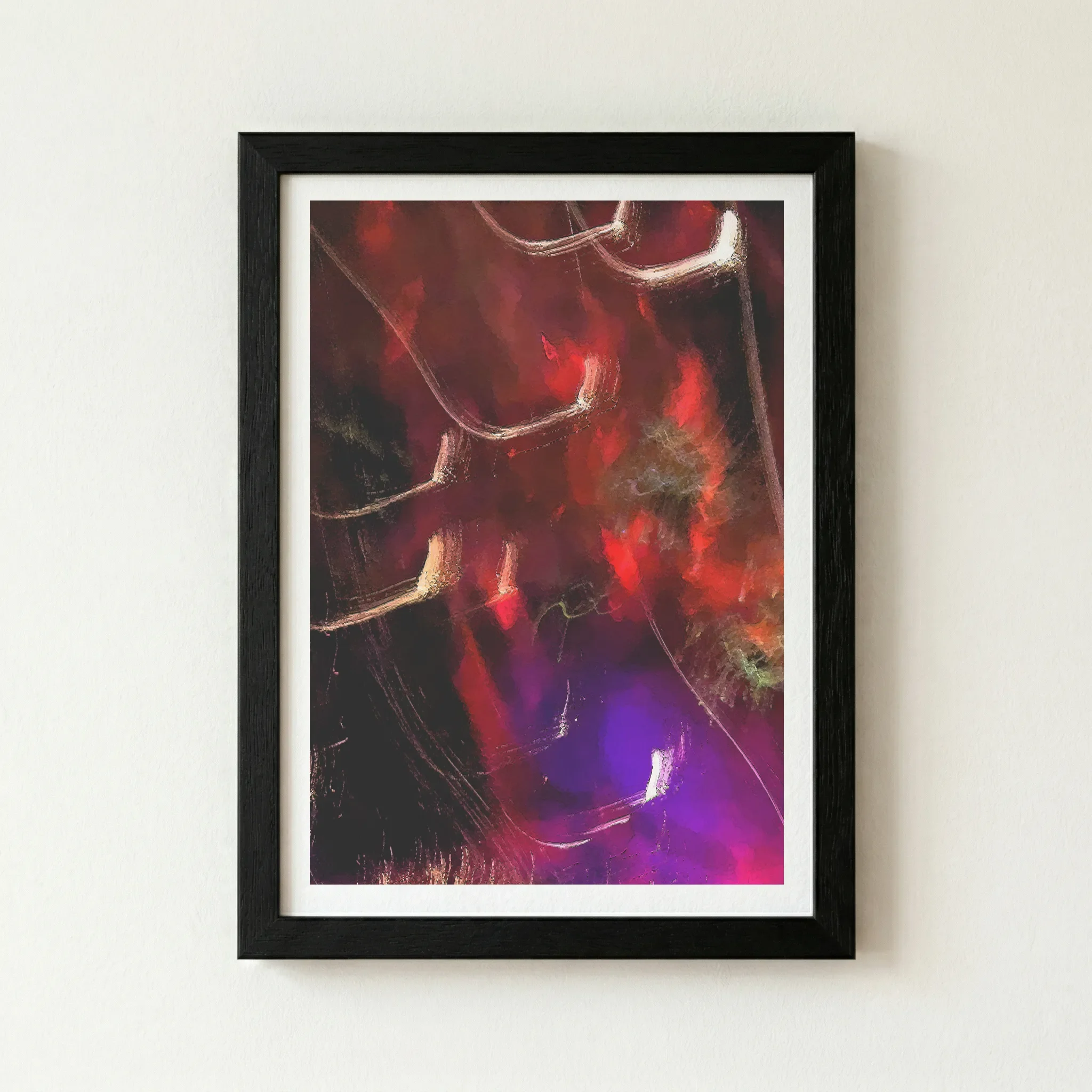 Image 3 of 6
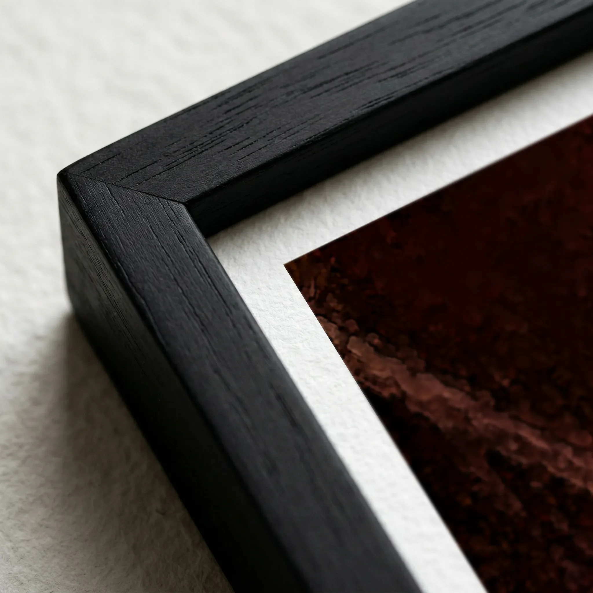 Image 4 of 6
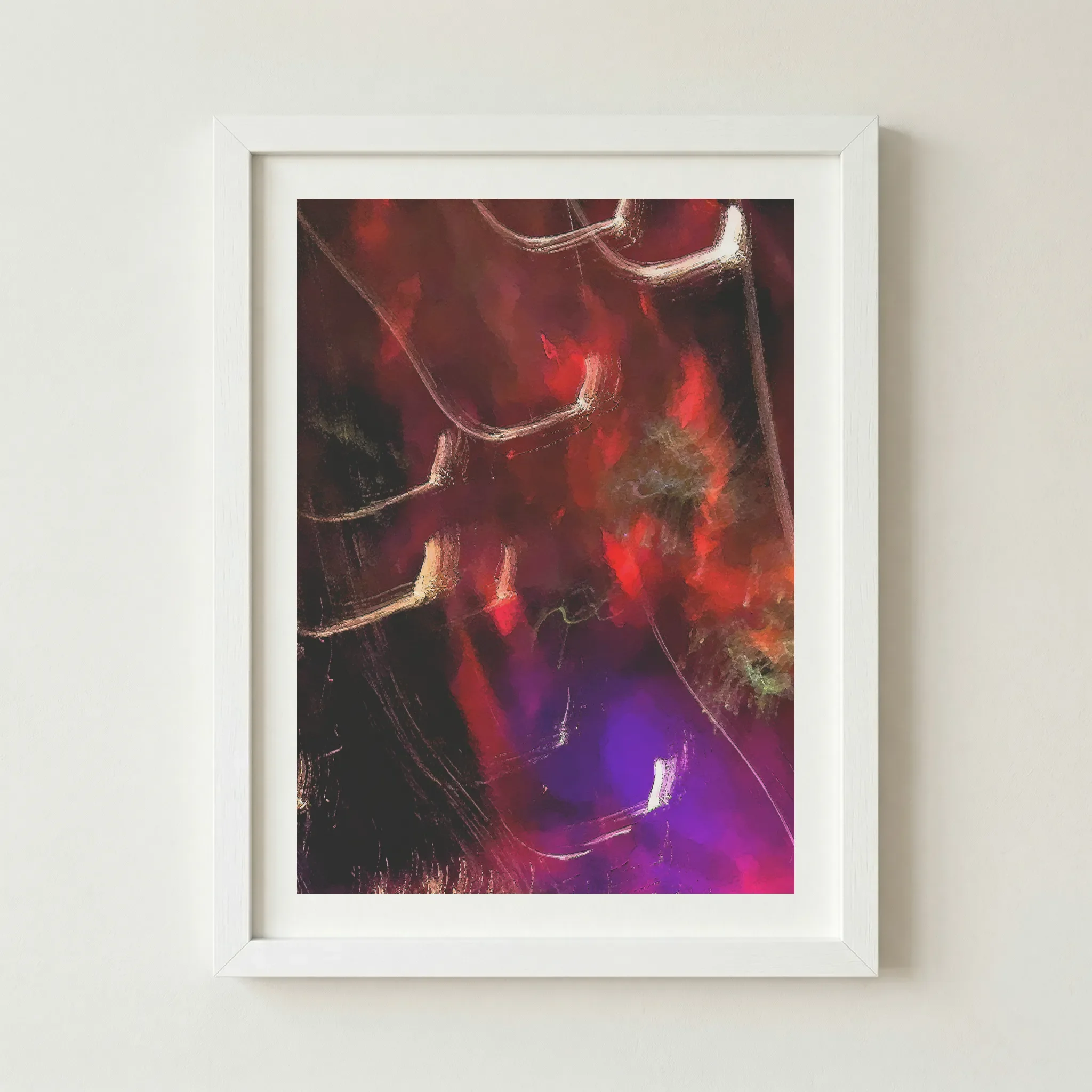 Image 5 of 6
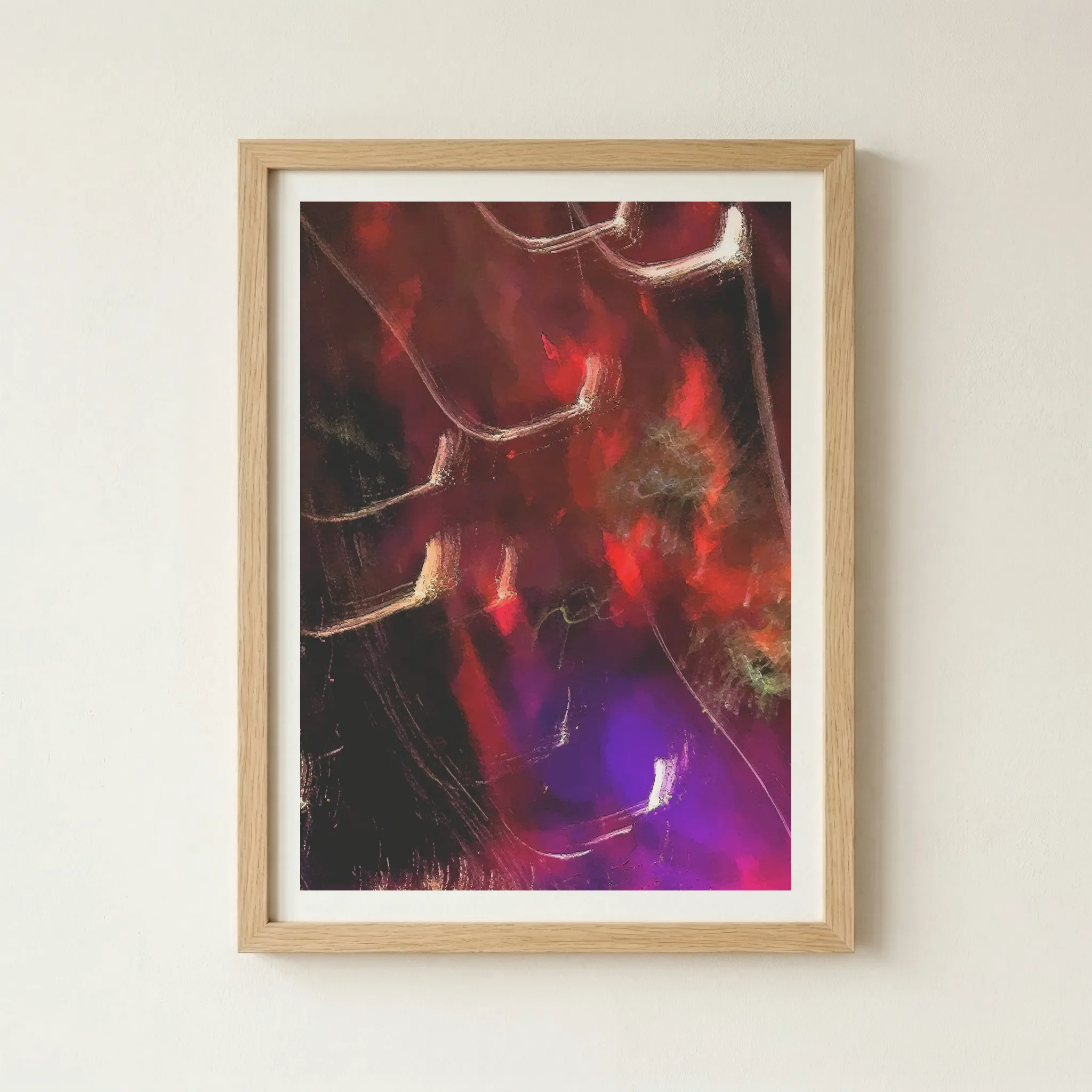 Image 6 of 6
Technical Specifications
| Feature | Unframed | Framed |
|---|---|---|
| Print Quality | 12-colour Giclée (Archival) | 12-colour Giclée (Archival) |
| Paper Stock | 200gsm Museum-Grade Matte | 200gsm Museum-Grade Matte |
| Frame Material | — | FSC-certified sustainable wood |
| Sustainability | 2 Trees Planted Per Order | 2 Trees Planted Per Order |
Size Guide
| Size | Metric (cm) | Imperial (in) |
|---|---|---|
| A4 | 21.0 × 29.7 | 8.3 × 11.7 |
| A3 | 29.7 × 42.0 | 11.7 × 16.5 |
| A2 | 42.0 × 59.4 | 16.5 × 23.4 |
| A1 | 59.4 × 84.1 | 23.4 × 33.1 |
Frame Colour
Black (Artist’s Choice)
Why This Works
A Black frame anchors the deep, moody shadows at the base of the print, making the kinetic energy of the light trails feel even more powerful. It provides a sleek, seamless border that lets the colours truly vibrate.
The Vibe (Bold & Dramatic)
This is the "Avant-Garde Gallery" look. It demands attention and feels incredibly premium.
Wood
Why This Works
To soften the intense, digital energy of the piece, a Natural Wood frame (like Oak) adds an organic, human touch. It bridges the gap between the high-concept abstract and the warmth of a lived-in home.
The Vibe (Warm & Sophisticated)
This creates a High-End Studio feel, making the art feel more integrated into a home with natural materials.
White
Why This Works
A White frame provides a sharp, clean break from the intense colours. It makes the white light trails the star of the show and gives the piece a more "modern pop" feel against your wall.
The Vibe (Contemporary & Bright)
This creates a Graphic Statement look, ideal for modern apartments and bright, airy spaces.
Artist's Nudge
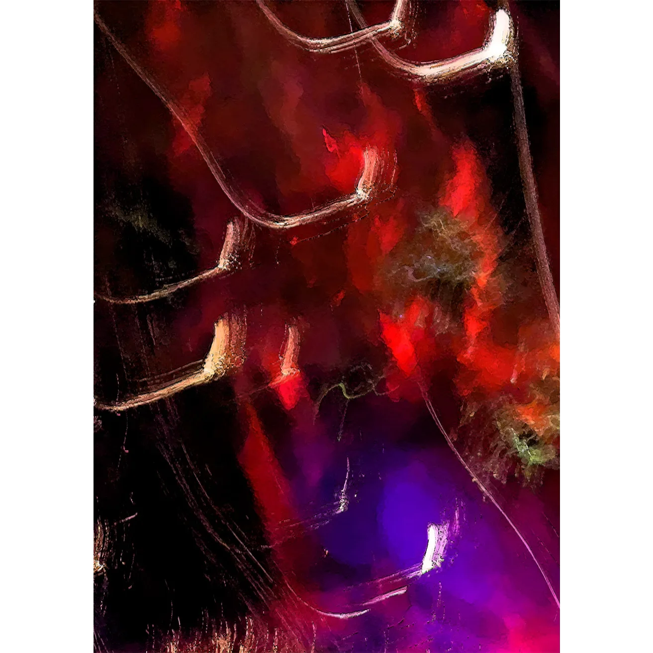
To truly capture the cinematic energy of this ICM Digital Painting, I highly recommend the Black frame. By merging with the darker tones of the "Dimension", the frame disappears into the background, allowing the vibrant "Future" light trails to leap off the wall with an almost three-dimensional intensity.
Frequently Asked Questions
What exactly is an ICM Digital Painting?
ICM stands for Intentional Camera Movement. It is a photographic technique where the camera is moved during a long exposure to create a painterly, abstract effect. The "digital painting" element comes from post-capture refinement that enhances the depth and vibrancy of the light trails.
How does the motion-blur look in a high-quality print?
Because we use 12-colour Giclée printing, the fluid "streaks" of light look incredibly smooth without any digital "banding". On our 200gsm museum-grade paper, the transition between the deep shadows and the bright highlights is rendered with exceptional detail.
Will the purple and red tones stay vibrant over time?
Yes. We use archival-quality pigment inks designed to resist fading for over 75 years. This ensures the intense energy and rich palette of the original work are preserved for a lifetime.
Does the matte paper affect the "glow" of the light trails?
Actually, it enhances it. By using a premium matte finish, we eliminate surface glare and reflections. This allows the high-contrast pigments to stand out, making the light trails appear to radiate directly from within the paper.
How should I style this piece in a modern home?
It works best on a neutral feature wall where the crimson and violet tones can provide a sophisticated pop of colour. It pairs excellently with minimalist furniture, leather textures, and metallic accents.
Is the frame glass or a different material?
We use shatter-resistant UV perspex for all our framed prints. It offers the same crystal-clear clarity as glass but is much more durable for shipping and provides essential protection against UV rays to keep your colours vibrant.