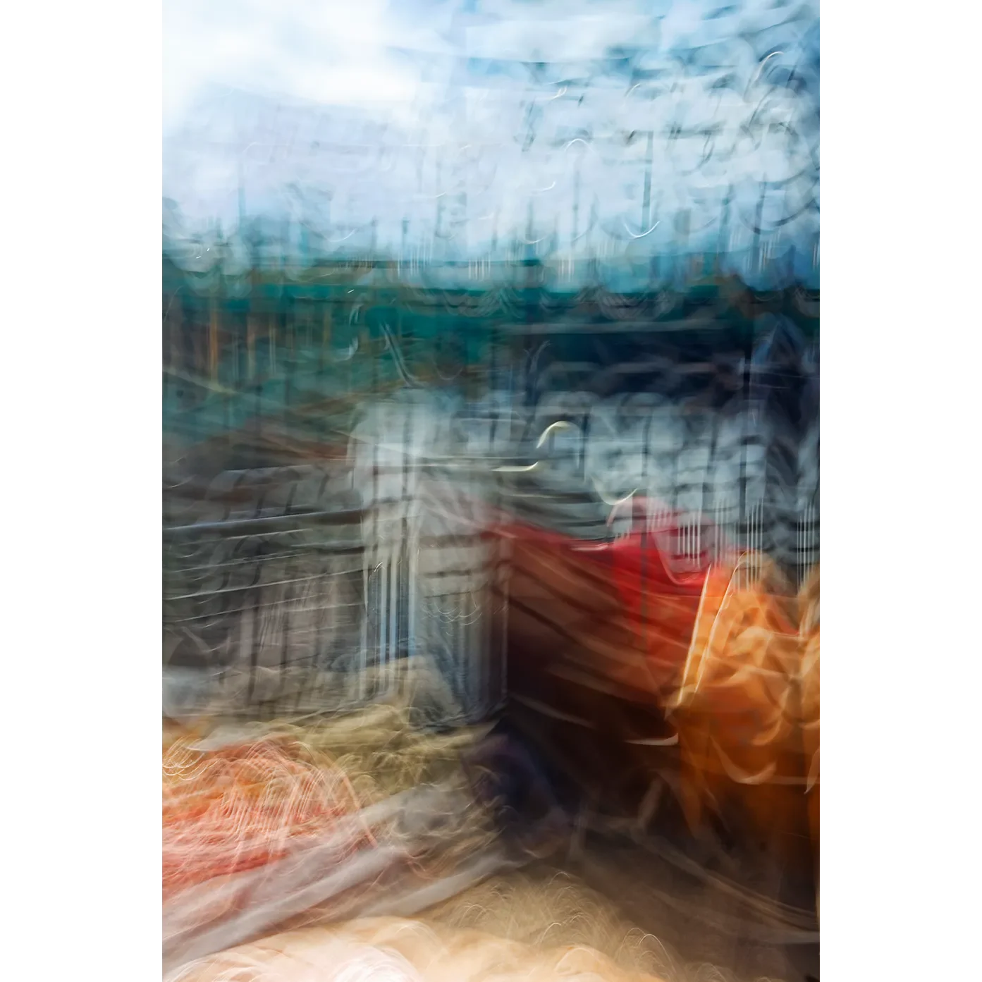
 Image 1 of 6
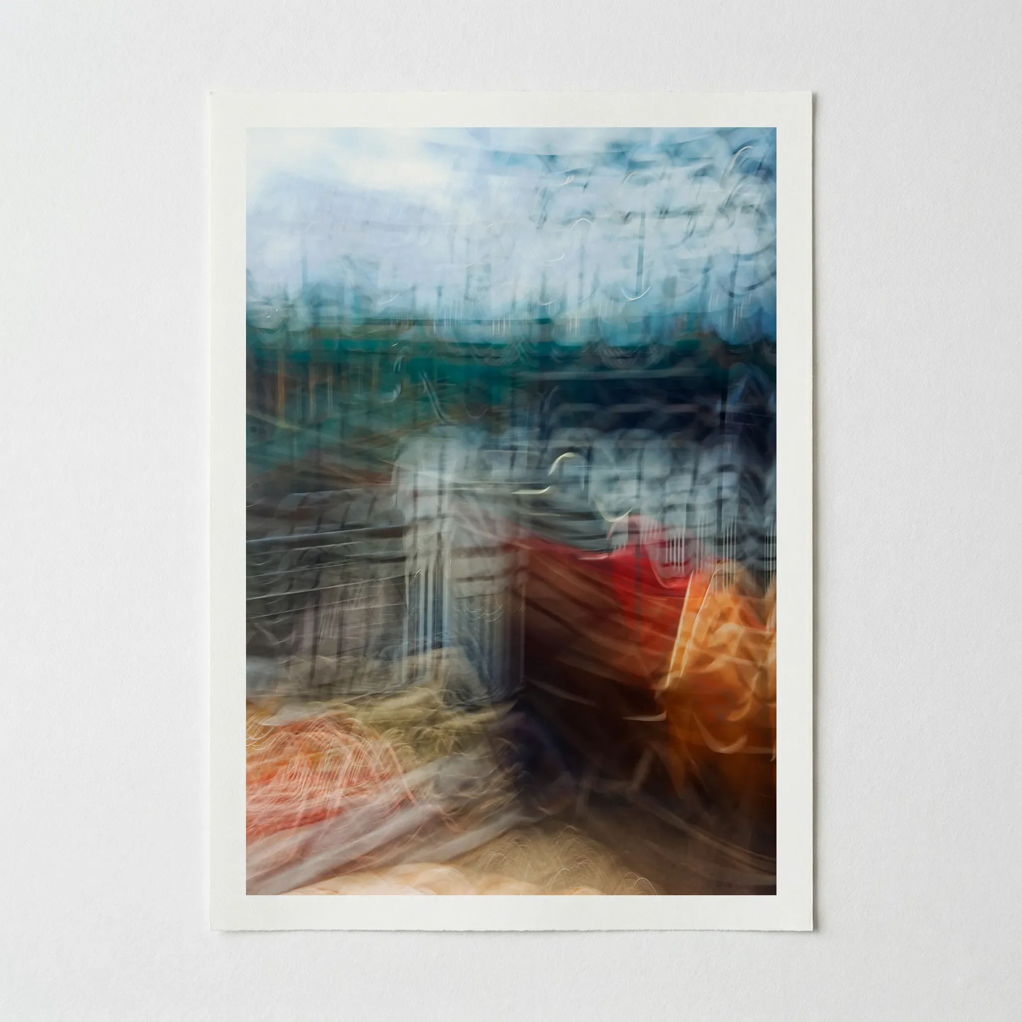 Image 2 of 6
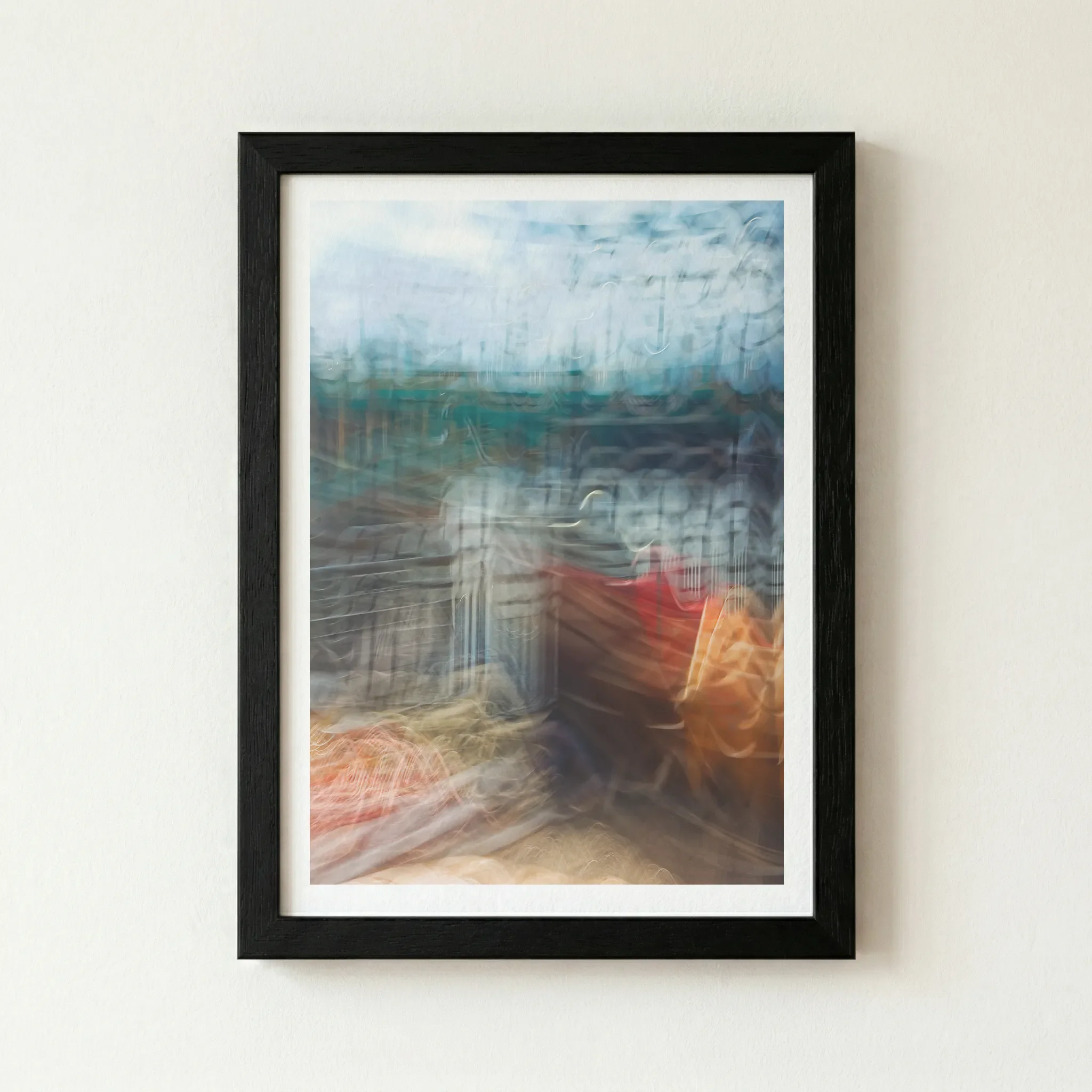 Image 3 of 6
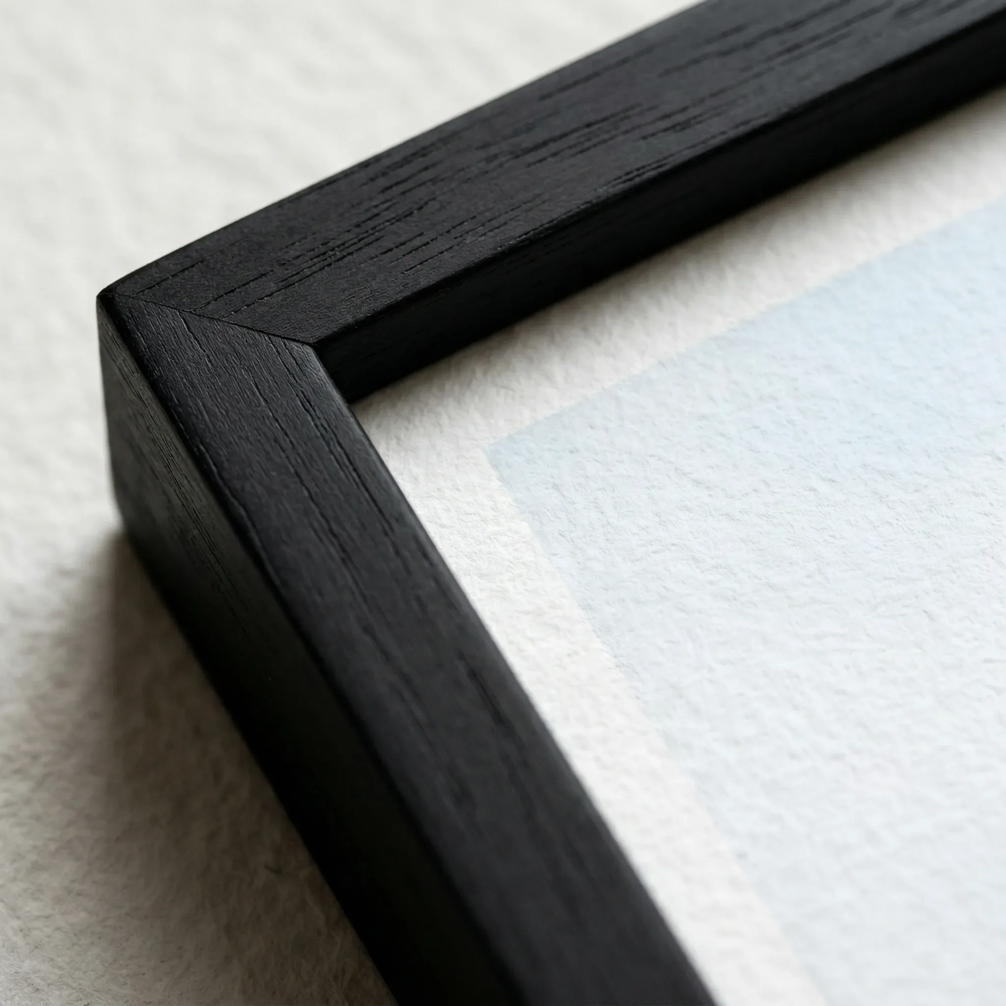 Image 4 of 6
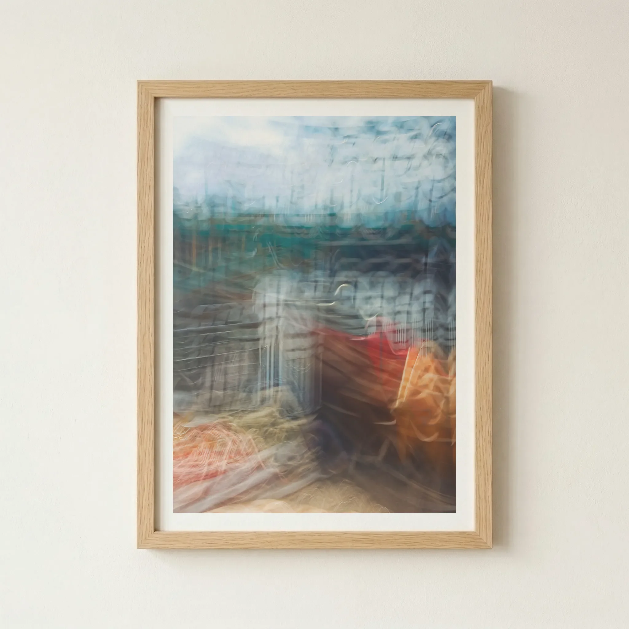 Image 5 of 6
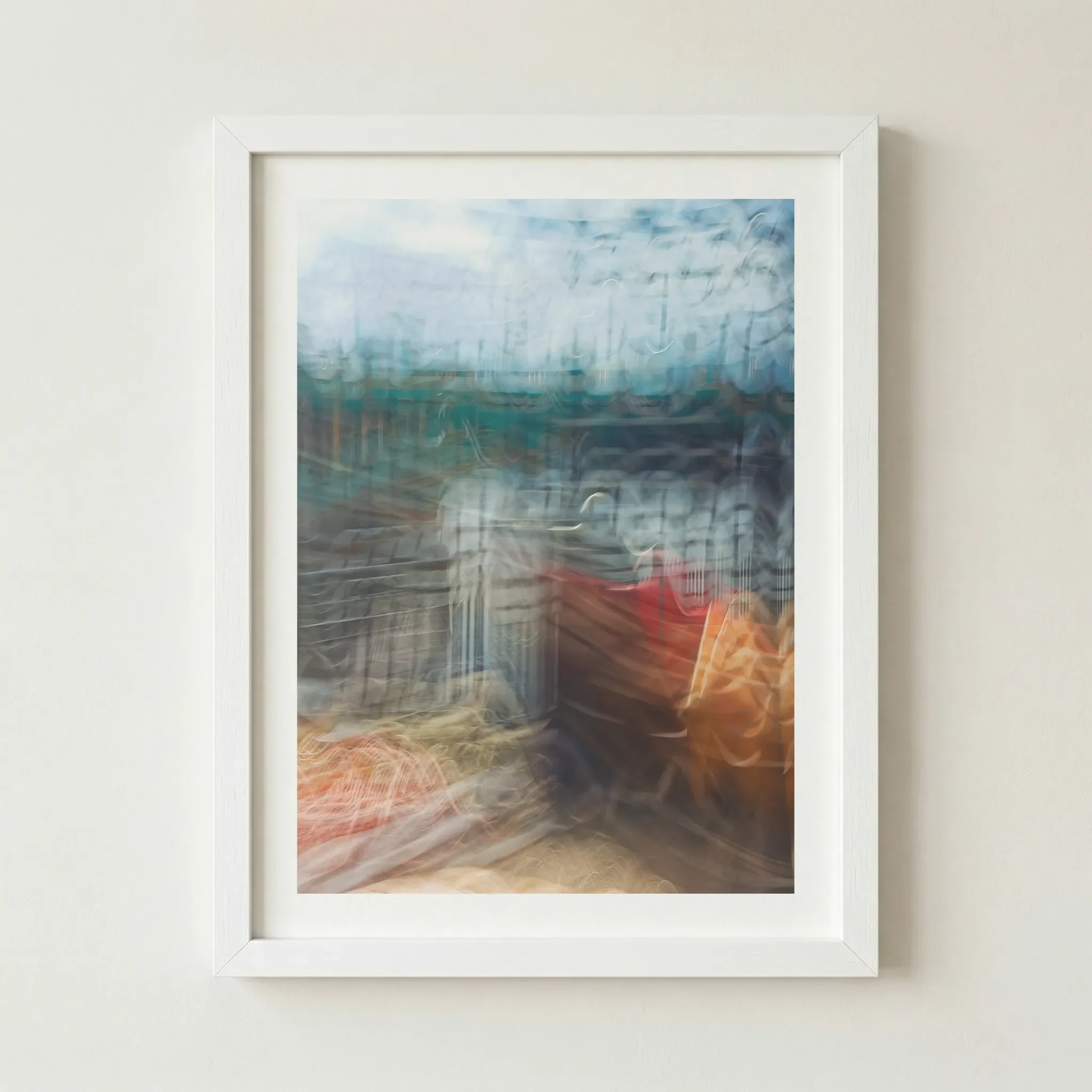 Image 6 of 6
Technical Specifications
| Feature | Unframed | Framed |
|---|---|---|
| Print Quality | 12-colour Giclée (Archival) | 12-colour Giclée (Archival) |
| Paper Stock | 200gsm Museum-Grade Matte | 200gsm Museum-Grade Matte |
| Frame Material | — | FSC-certified sustainable wood |
| Sustainability | 2 Trees Planted Per Order | 2 Trees Planted Per Order |
Size Guide
| Size | Metric (cm) | Imperial (in) |
|---|---|---|
| A4 | 21.0 × 29.7 | 8.3 × 11.7 |
| A3 | 29.7 × 42.0 | 11.7 × 16.5 |
| A2 | 42.0 × 59.4 | 16.5 × 23.4 |
| A1 | 59.4 × 84.1 | 23.4 × 33.1 |
Frame Colour
Black (Artist’s Choice)
Why This Works
A Black frame acts as a strong anchor for the fluid motion. It contrasts sharply with the teals and allows the central red "distortion" to become the undeniable hero of the piece.
The Vibe (Bold & Dramatic)
This is the "Avant-Garde Gallery" look. It demands attention and feels incredibly premium.
Wood
Why This Works
To soften the digital-motion energy of the piece, a Natural Wood frame adds an organic, human touch.
The Vibe (Warm & Sophisticated)
This creates a High-End Studio feel, making the art feel more integrated into a home with natural materials.
White
Why This Works
A White frame lightens the entire composition. It highlights the brighter, airier sections of the blur and gives the artwork a more ethereal, "window-like" quality.
The Vibe (Contemporary & Bright)
This creates a Graphic Statement look, ideal for modern apartments and bright spaces.
Artist's Nudge
If you want to lean into the mystery of this piece, I highly recommend the Black frame. By containing the fluid motion within a dark border, the "distortion" feels more deliberate and the colours appear more vibrant, turning the artwork into a powerful portal of energy on your wall.
Frequently Asked Questions
What is ICM art?
ICM stands for Intentional Camera Movement. It is a technique where the artist moves the camera during a long exposure to create a painterly, abstract effect.
Is this a photograph or a painting?
It is a photograph captured in a single exposure. While it has a "painterly" feel, every texture and colour comes from the real world, transformed through motion.
Does the matte paper affect the vibrant red tones?
Not at all. We use a 12-colour Giclée process with archival pigment inks. On 200gsm matte paper, the reds remain deep and velvety while the teals stay bright and crisp.
How does this piece pair with others?
'Distorted Reality' pairs exceptionally well with other motion-heavy abstracts, such as Dimension and Future, as they share a similar cinematic language.
How should I style this in a modern home?
It works best on a neutral feature wall where the teals and reds can provide a sophisticated pop of colour.
Is the frame glass or a different material?
We use shatter-resistant UV perspex for all our framed prints, providing crystal-clear clarity and essential protection against UV rays.