 Image 1 of 6
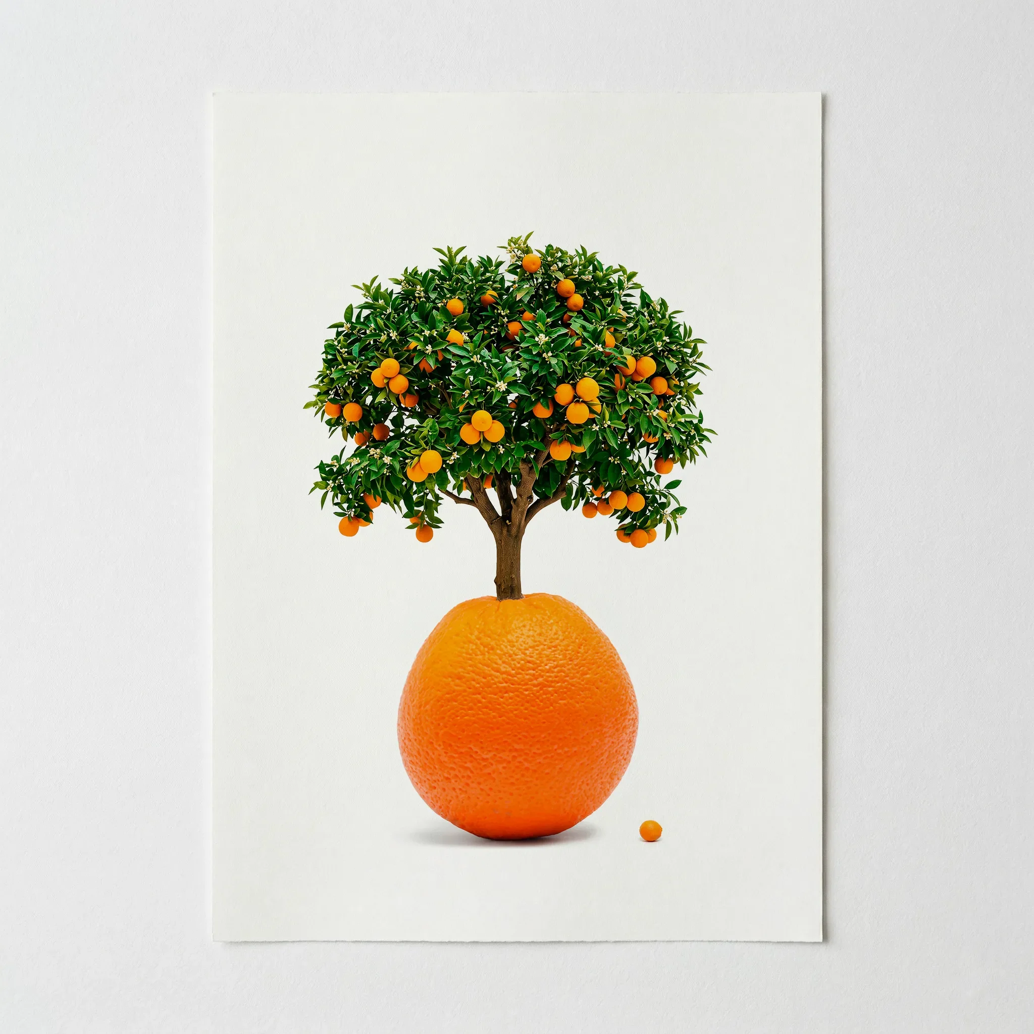 Image 2 of 6
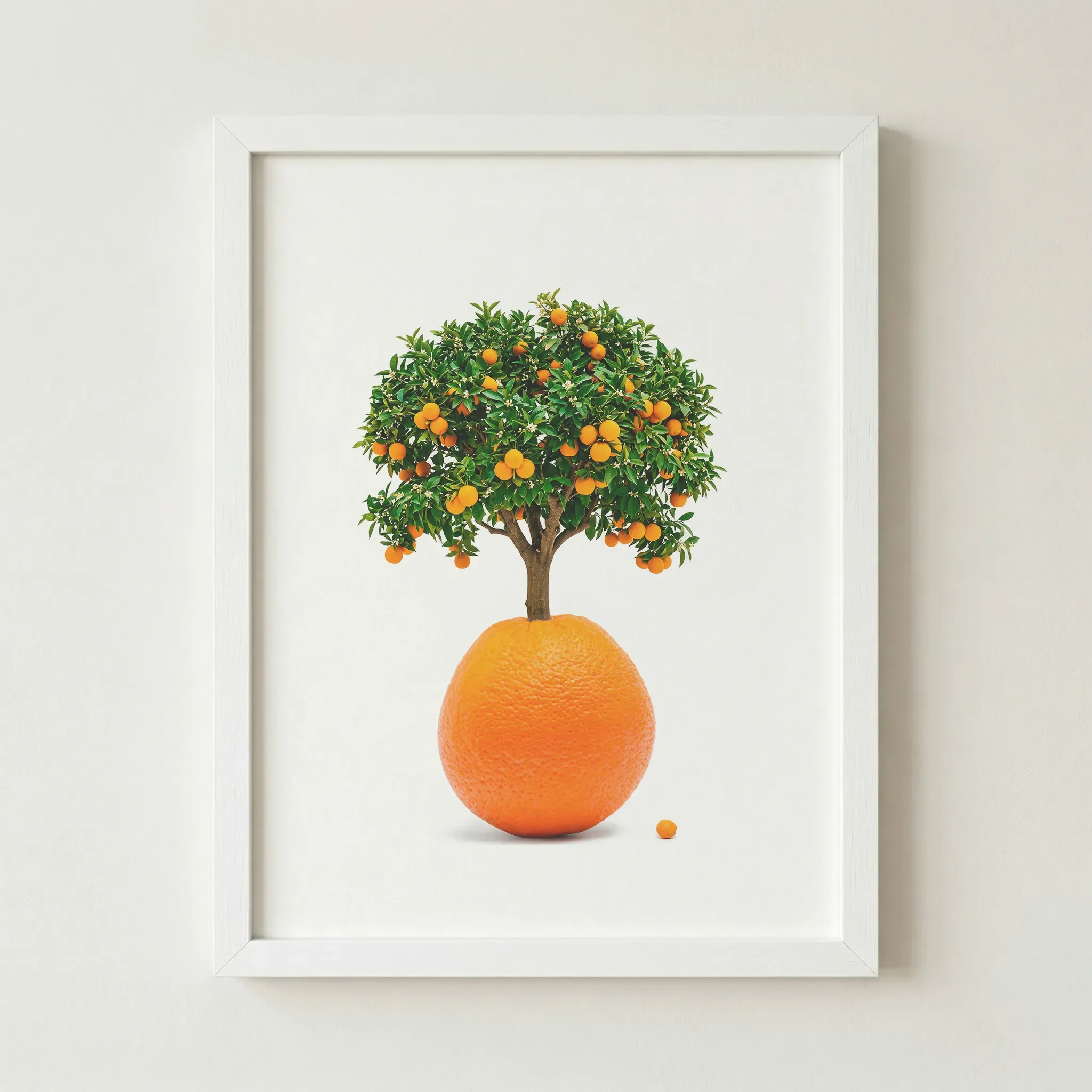 Image 3 of 6
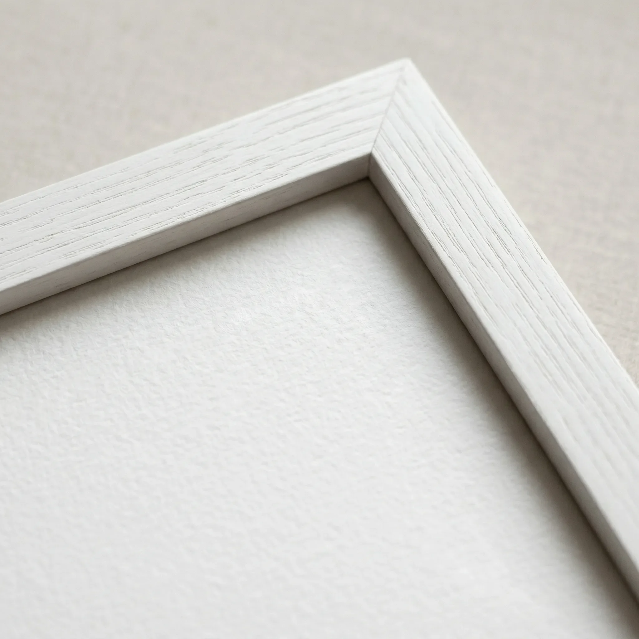 Image 4 of 6
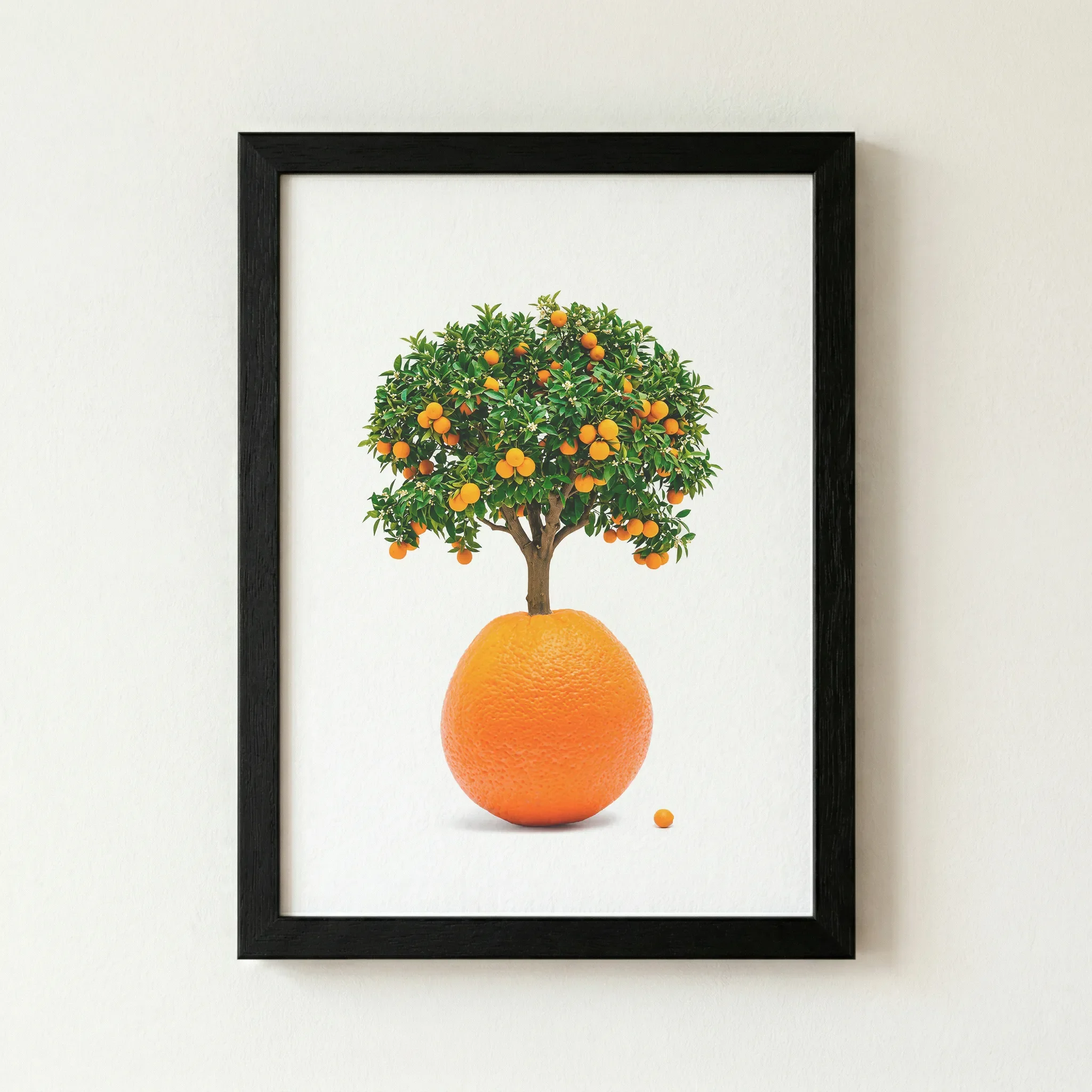 Image 5 of 6
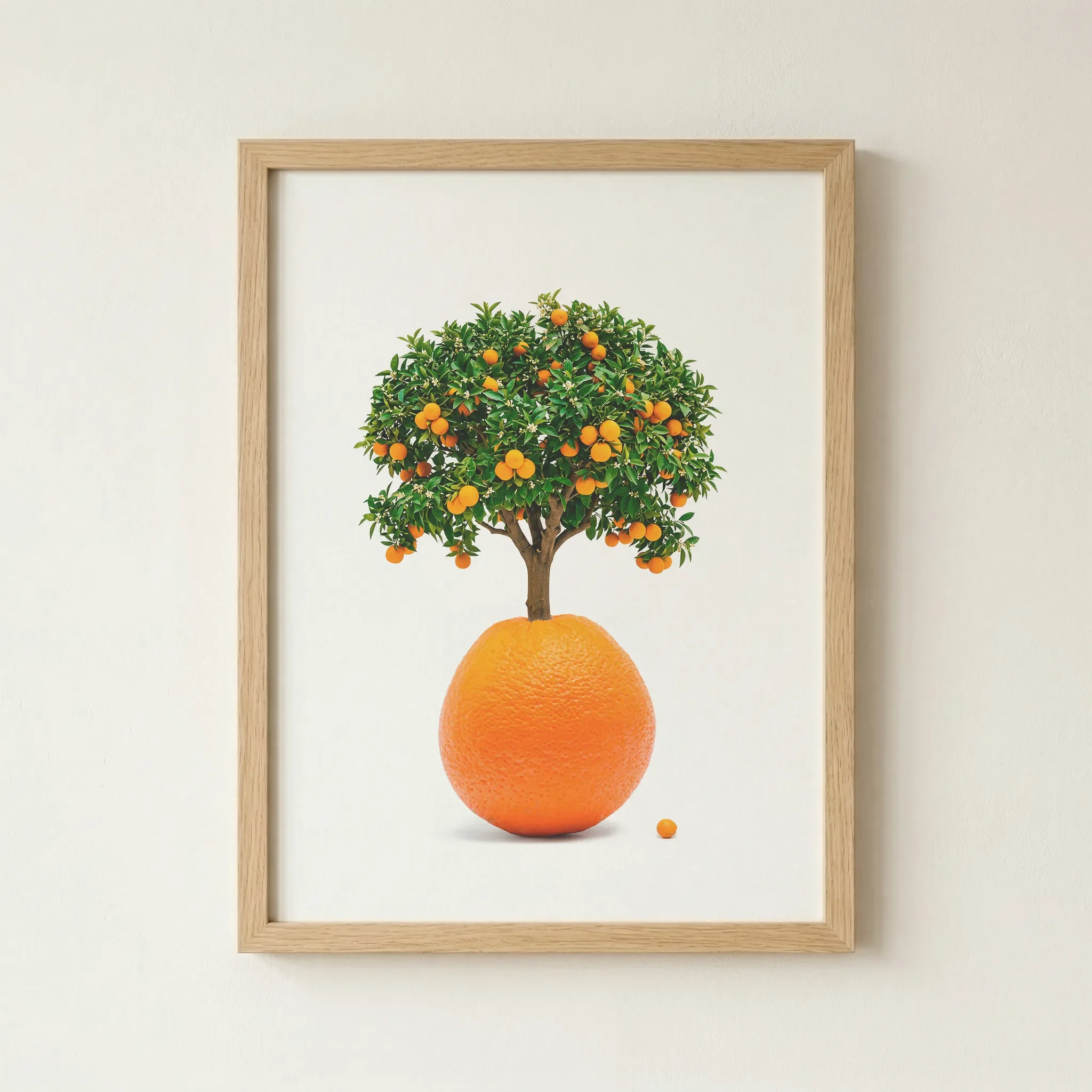 Image 6 of 6
Technical Specifications
| Feature | Unframed | Framed |
|---|---|---|
| Print Quality | 12-colour Giclée (Archival) | 12-colour Giclée (Archival) |
| Paper Stock | 200gsm Museum-Grade Matte | 200gsm Museum-Grade Matte |
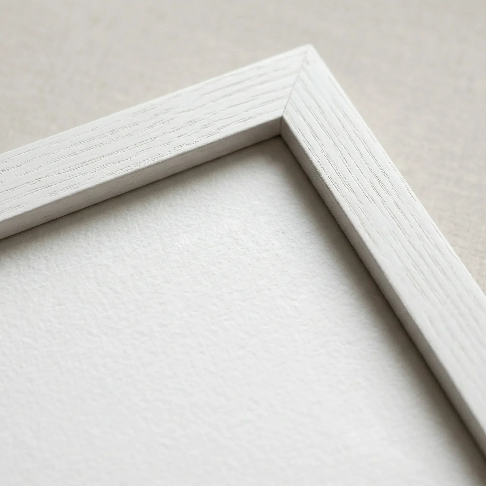
| Frame Material | — | FSC-certified sustainable wood |
| Sustainability | 2 Trees Planted Per Order | 2 Trees Planted Per Order |
Size Guide
| Size | Metric (cm) | Imperial (in) |
|---|---|---|
| A4 | 21.0 × 29.7 | 8.3 × 11.7 |
| A3 | 29.7 × 42.0 | 11.7 × 16.5 |
| A2 | 42.0 × 59.4 | 16.5 × 23.4 |
| A1 | 59.4 × 84.1 | 23.4 × 33.1 |
Frame Colour
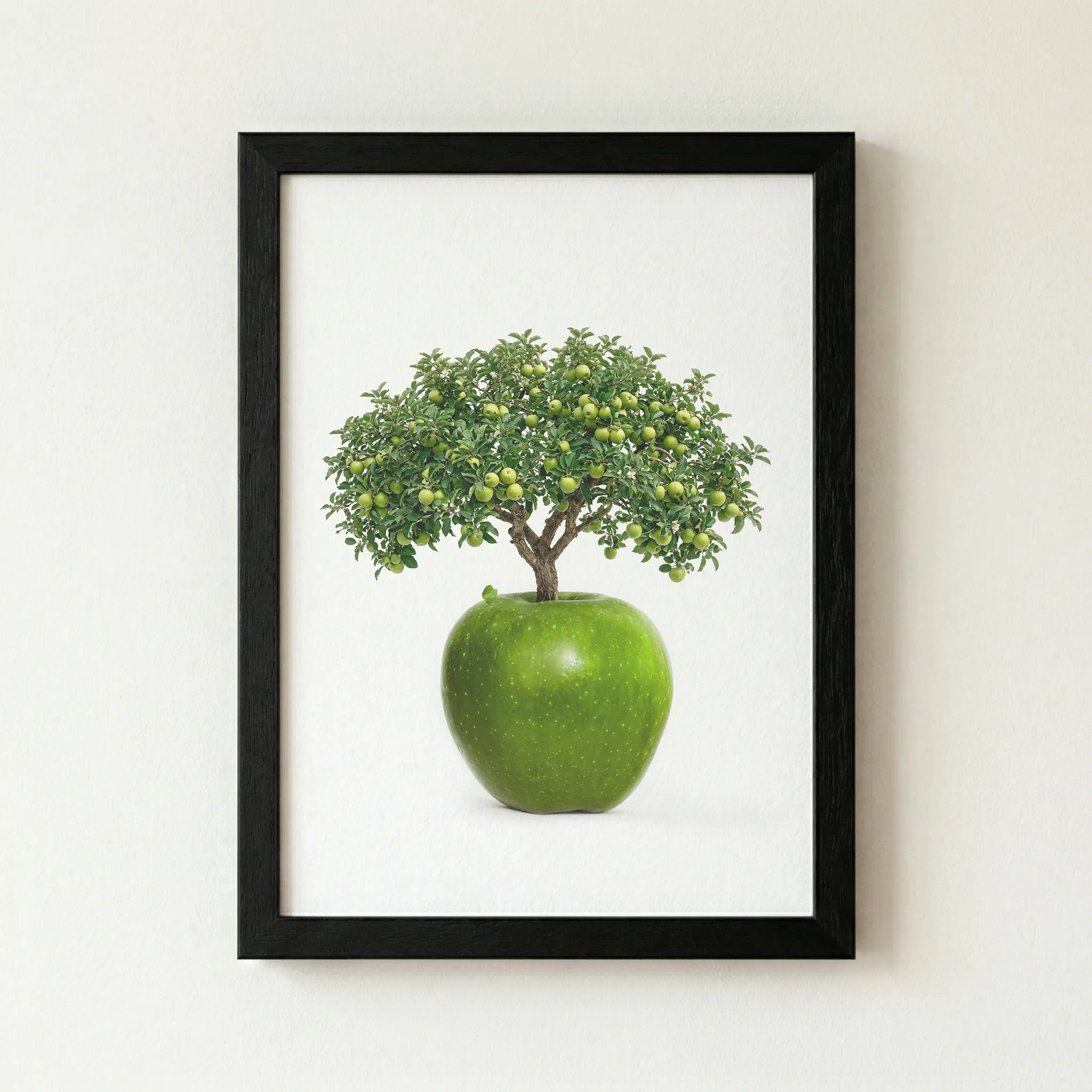
Black
Why This Works
A Black frame acts as a bold border, framing the "impossible" tree like a specimen in a high-end gallery.
The Vibe (Cinematic & Dramatic)
Sophisticated, graphic, and sharp. It is best suited for professional settings or as a primary focal point against a neutral wall.
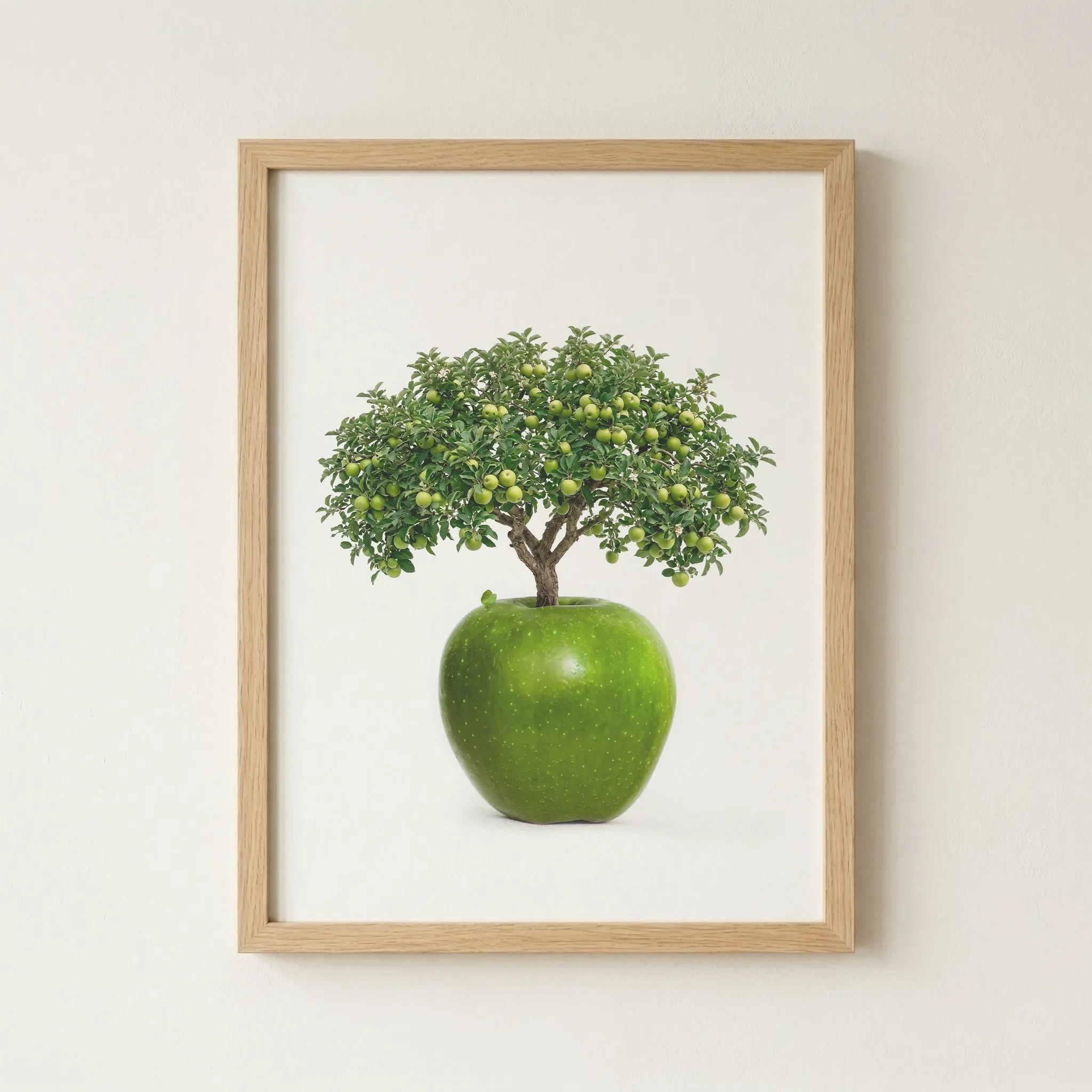
Natural Wood
Why This Works
The organic grain and pale honey tones of the wood provide a beautiful, earthy contrast to the precision of the print, grounding the surreal concept in a traditional botanical frame.
The Vibe (Timeless & Grounded)
A welcoming and sophisticated feel that bridges the gap between surrealism and nature. It is best suited for Scandi-style interiors and rooms with plenty of houseplants.
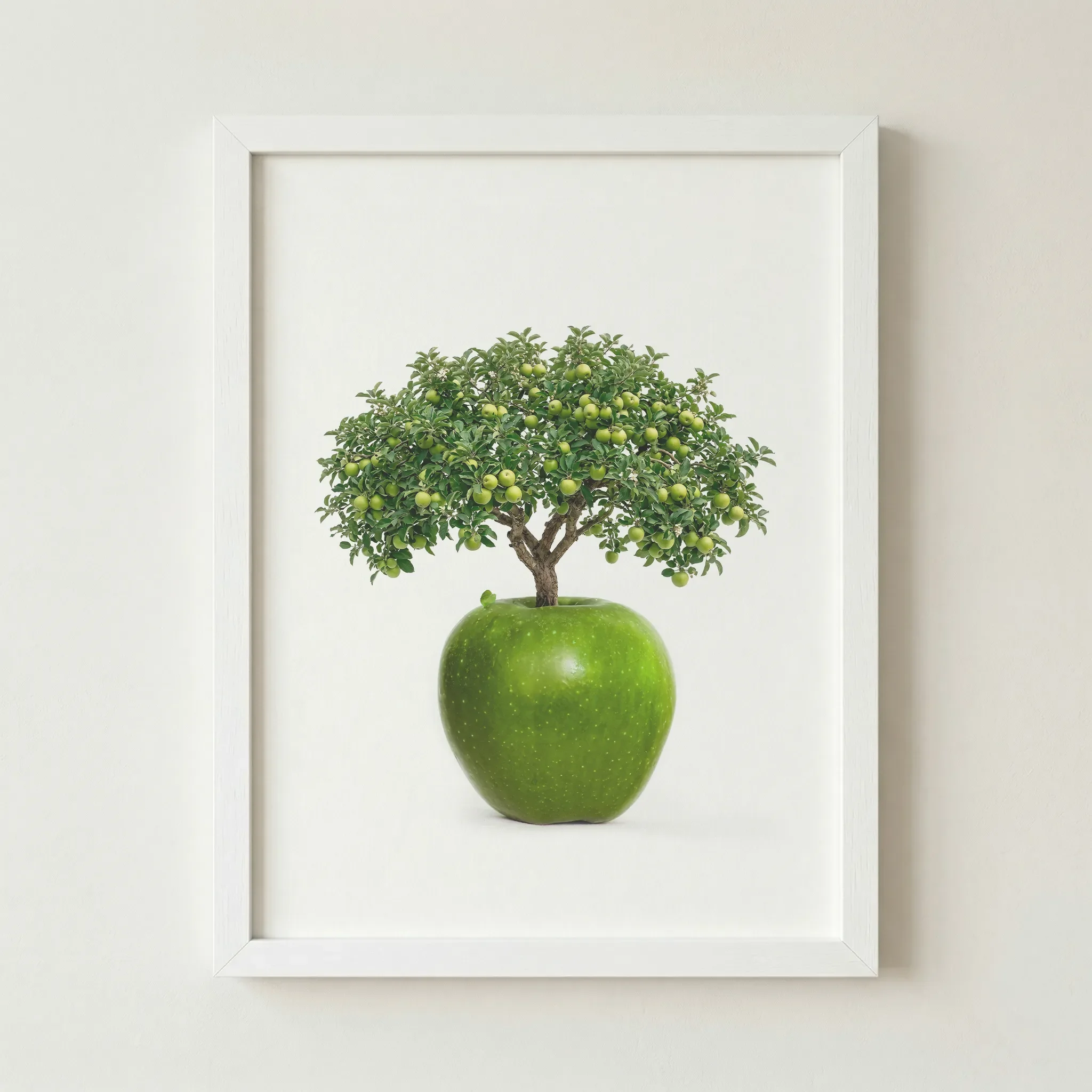
White (Artist's Choice)
Why This Works
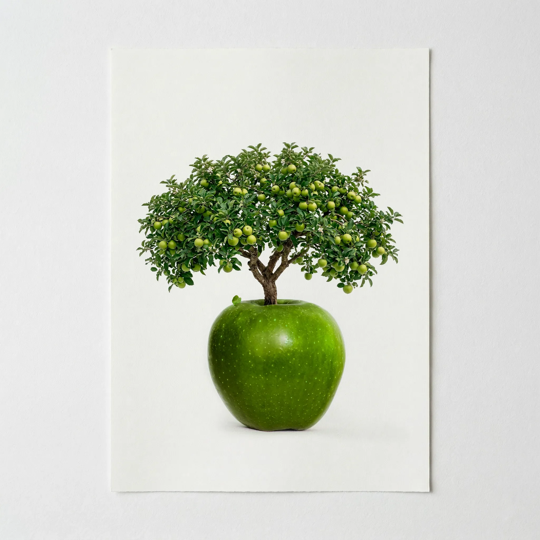
The White frame allows the artwork to blend seamlessly into your wall, making the surreal orange look as though it is floating in mid-air.
The Vibe (Modern & Fresh)
Graphic, airy, and high-contrast. It turns the artwork into a luminous "window" on your wall and is best suited for minimalist apartments and bright contemporary kitchens.
Artist's Nudge
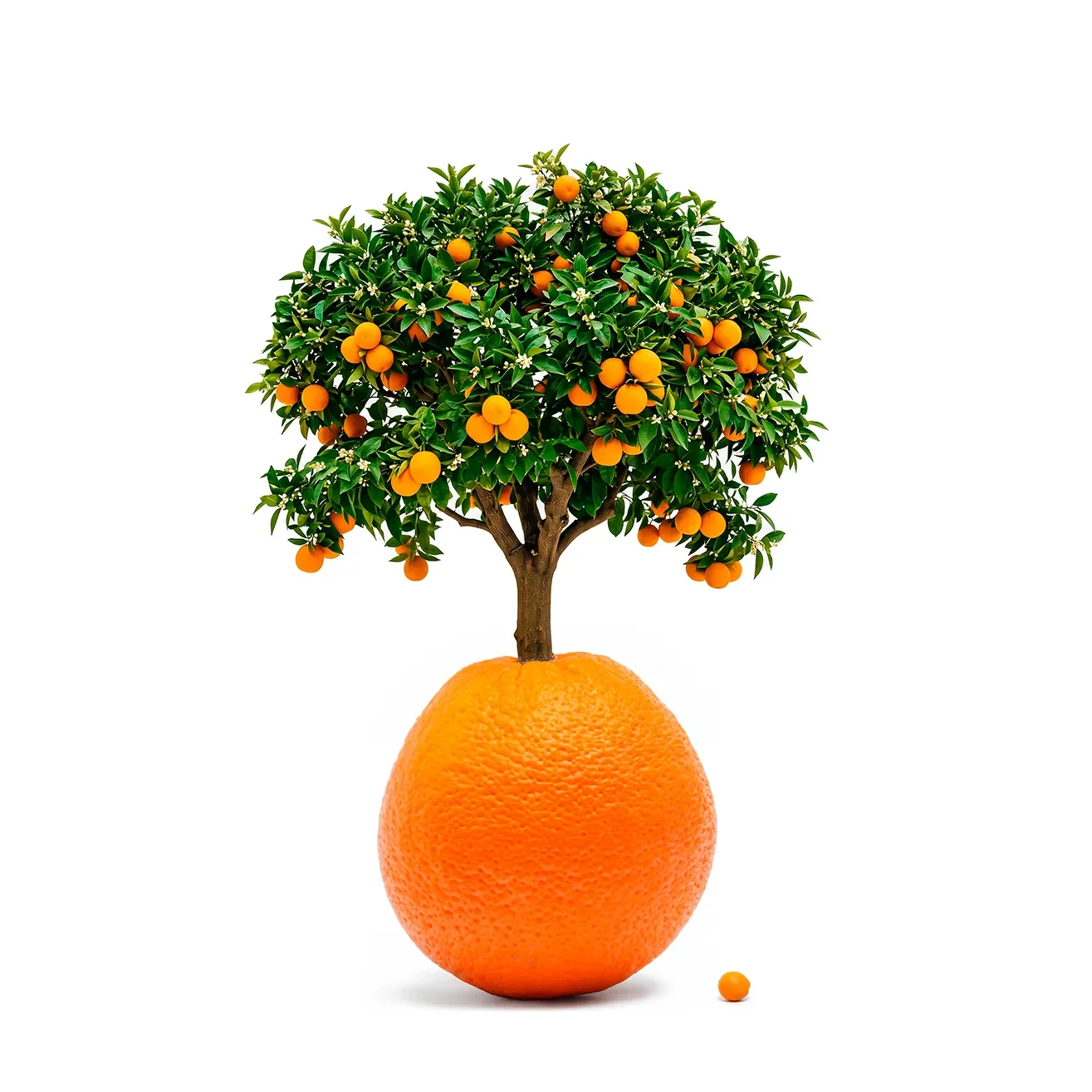
For the most striking look, I highly recommend the White frame. It removes the visual boundary between the print and your wall, allowing the cleverness of the "tree within an orange" to speak entirely for itself, a minimalist masterpiece for any home.
Frequently Asked Questions
Is the background pure white?
Yes. The background is a clean, archival white designed to create a high-contrast look that fits perfectly in minimalist or contemporary interiors.
How would you describe the style of this art?
It falls under "Minimalist Surrealism." It uses real-world textures and subjects but arranges them in a way that is physically impossible to create a sense of wonder.
Does the orange look the same on the print?
Our 12-colour Giclée process is specifically designed to handle vibrant citrus tones and subtle gradients, ensuring the fruit looks crisp and "fresh-picked".
Does the matte paper affect the vibrancy?
Not at all. We use museum-grade matte paper specifically because it absorbs the archival inks deeply, providing a rich, velvet-like finish that maintains intense colour saturation without glare.
Can I pair this with other prints?
Absolutely. It pairs perfectly with our 'The Apple Tree' print to create a striking diptych of conceptual botanical art.